How to Build a Self-Service IT Portal
Delivering IT services is a costly, laborious process. In particular, huge swathes of technical colleagues’ time is used up on relatively menial admin tasks.
Today, we’re looking at one solution to this problem - building a custom IT portal to help users self-serve for common support tasks.
Specifically, we’re going to demonstrate how we can use Budibase to build bespoke self-service portals with minimal custom coding.
By the end, we’ll have a fully functioning, highly extensible solution for supercharging efficiency around IT service delivery.
But first…
What is an IT portal?
An IT portal is a secure, centralized tool where users can access key internal services and information about processes.
In practice, this can comprise quite a wide range of different functions. Some of the most common services include providing documentation and support information, knowledge base tools, asset management, request workflows, support ticketing, and more.
Some more advanced IT portals might also include more sophisticated functionality like software launching, identity management, usage analytics, or other company-specific features.
In any case, the goal is twofold.
First, we want to regularize how IT services are accessed and delivered. Second, we want to boost efficiency within delivery workflows by reducing the need for technical colleagues to intervene in more basic tasks.
With that in mind…
What are we building?
We’re building a simple IT portal with two key pieces of functionality. First, we’ll provide a knowledge base to empower users to self-serve on common support issues. Second, we’ll build a ticketing system for users to submit support requests that fall outside of this.
However, this is by no means the limit of what’s possible.
Instead, we want to show off the speed and ease with which we can build out functional portals - but we also have the option of scaling horizontally by adding new functions with the same basic processes.
So, here’s a quick demo of our portal’s knowledge base:
And our ticketing tools:
So, let’s see how this works in Budibase.
How to build an IT portal in 9 steps
If you haven’t already, the first thing you’ll want to do is sign up for a free Budibase account to start building as many custom applications as you need.
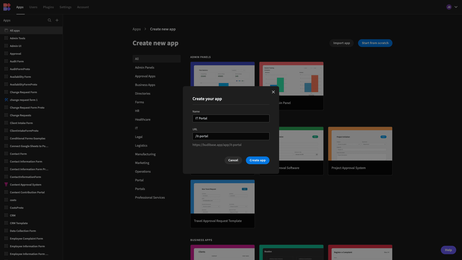
Then, we need to create a new Budibase application. We have the option of starting with a template or importing an existing app dump, but today, we’re going to start from scratch.
When we choose this option, we’re prompted to give our app a name and URL extension. We’ll simply call ours IT Portal.
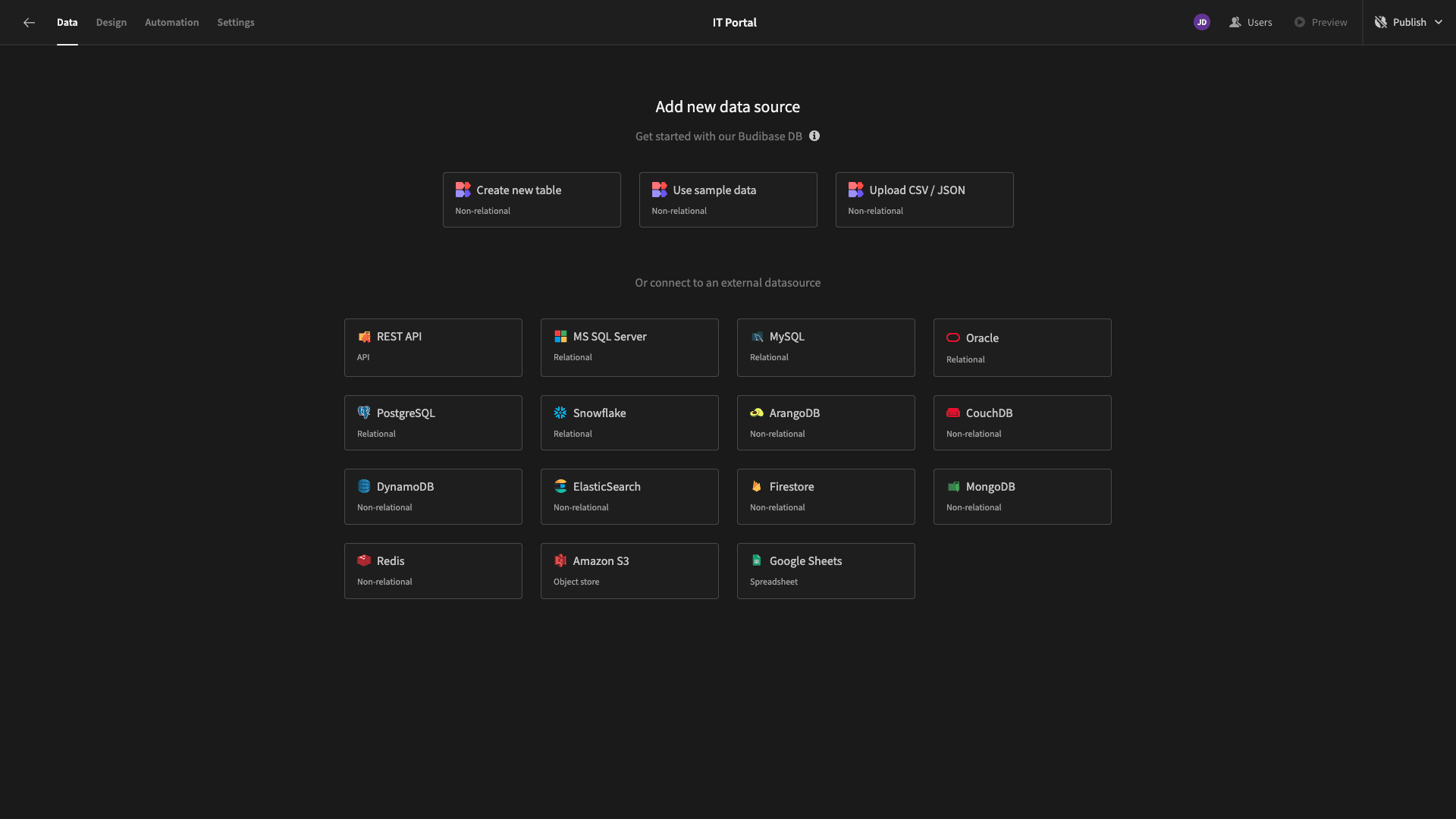
Then, we’re prompted to choose which kind of data source we’d like to connect to our app. Budibase offers dedicated connectors for relational databases, NoSQL tools, APIs, Google Sheets, and more - alongside our internal, low-code database.
That brings us to…
1. Creating our knowledge base data model
Budibase gives us the flexibility to build portals on top of just about any existing data. However, today, we want to build our data model from scratch using BudibaseDB.
We’ll start by hitting Create New Table.

Then, we need to give our new table a name. We’ll call ours Knowledge Base.
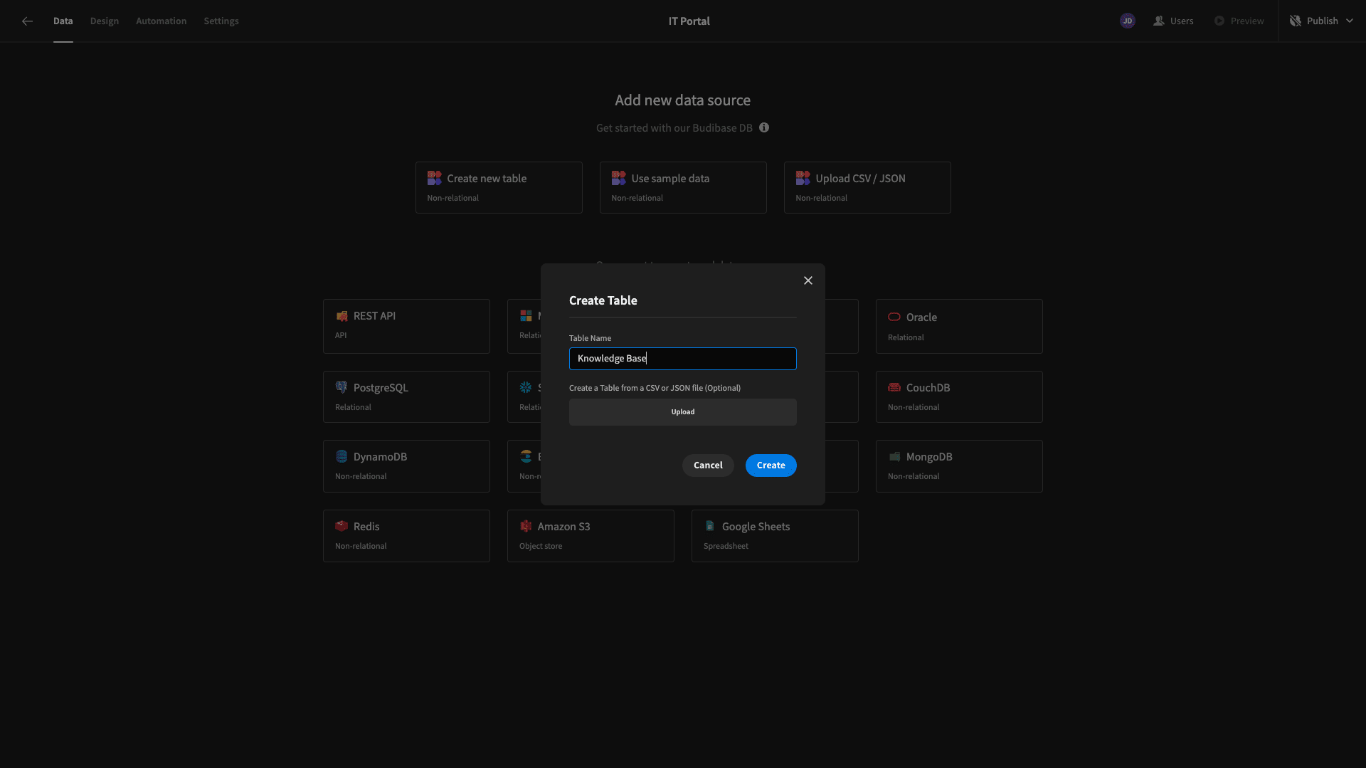
Once we hit Create, we’ll have an empty database table.
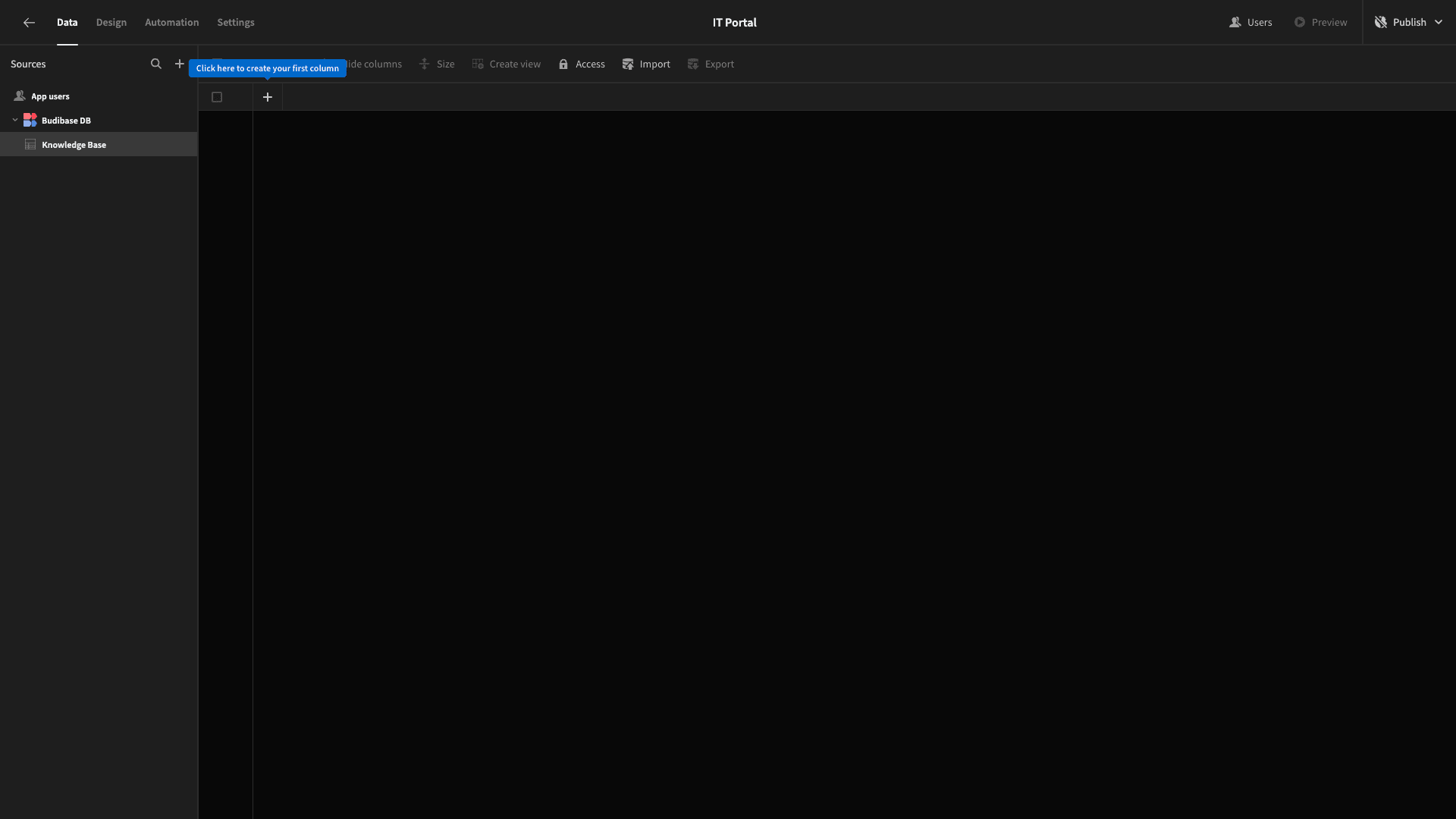
We can use the plus icon to start adding columns.
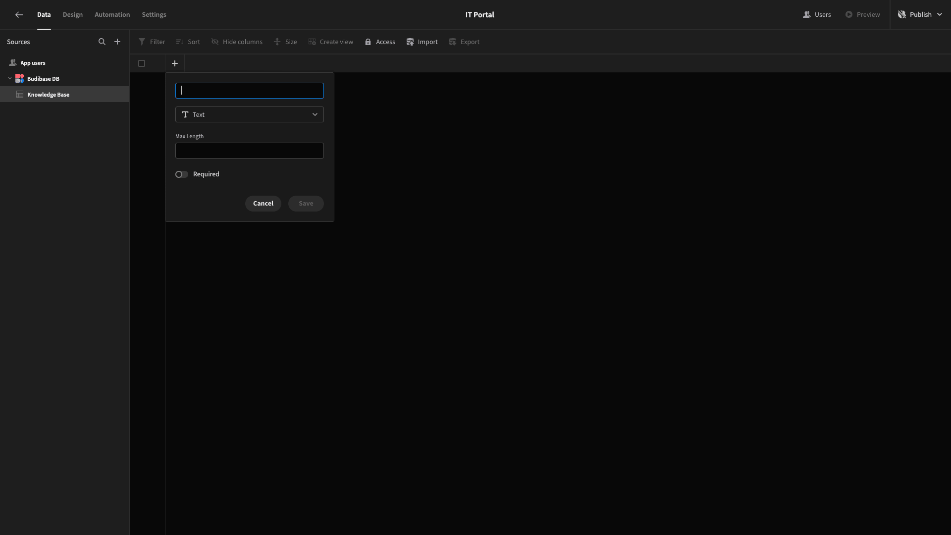
So, it’s time to think about which specific attributes we’ll need to store for each of our knowledge base articles.
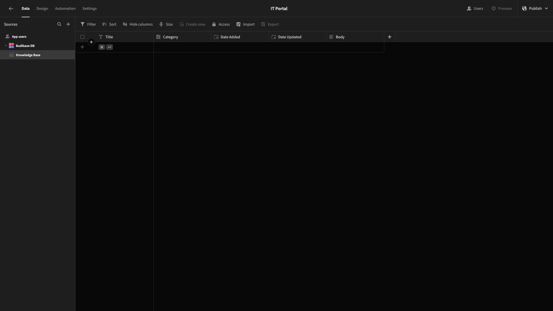
We’re going to add columns with the following names and types:
- Title - text,
- Category - options,
- Date Added - date,
- Date Update - date,
- Body - long-form text.
Here’s what this will look like.
There are a few final tweaks we want to make before we move on to building our interfaces.
First, the Category column is an options attribute. So, we’ll need to define what these options are.
We’ll open the settings for this column and hit Add Option:
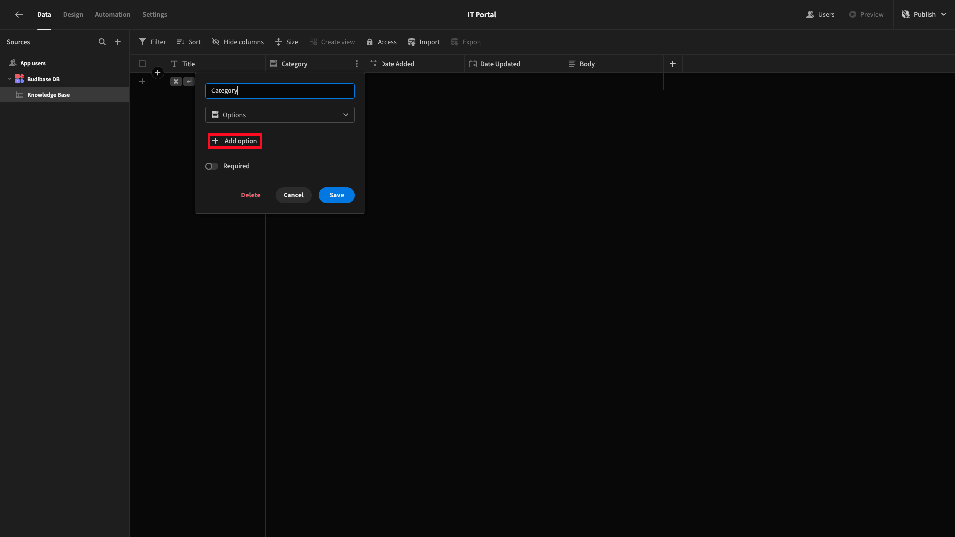
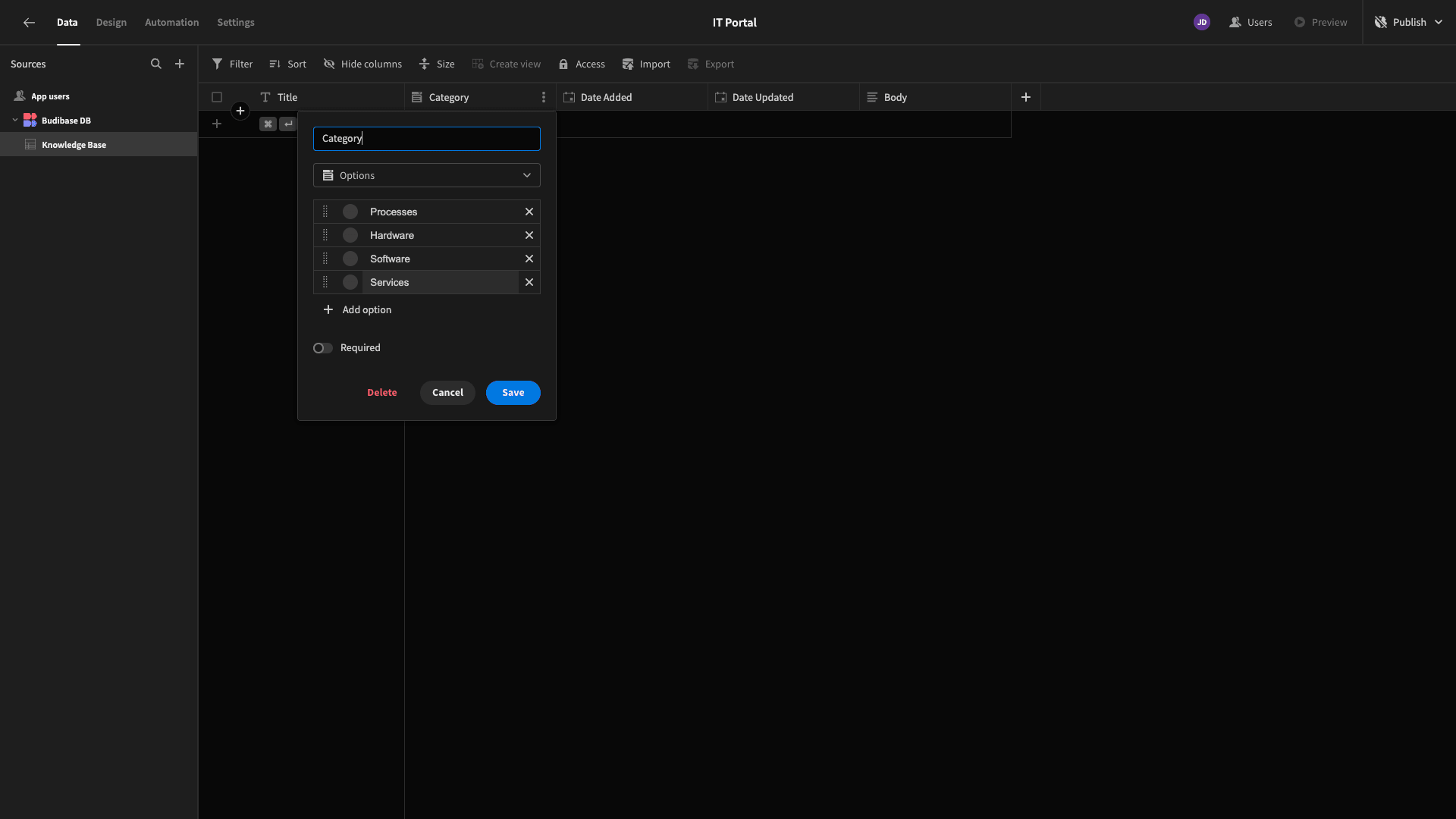
We’re going to add the following options:
- Processes,
- Hardware,
- Software,
- Services.
We’ll also update our two dates to enable the Date Only setting.
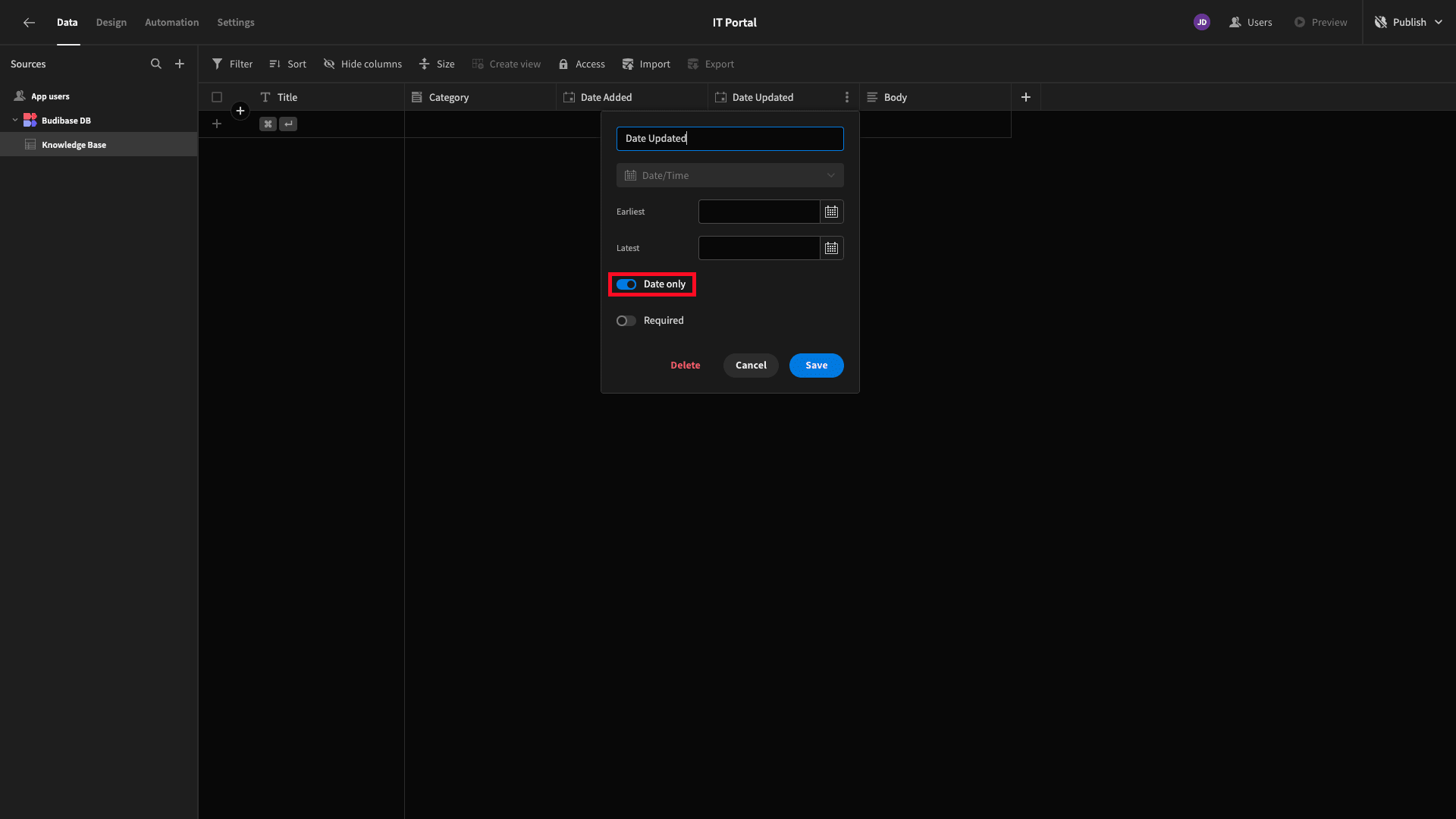
While we’re here, we’ll also update our long-form text column and select the Enable Markdown Editing setting.
Finally, we’ll add a few rows of dummy data, and that’s our database table ready to go.
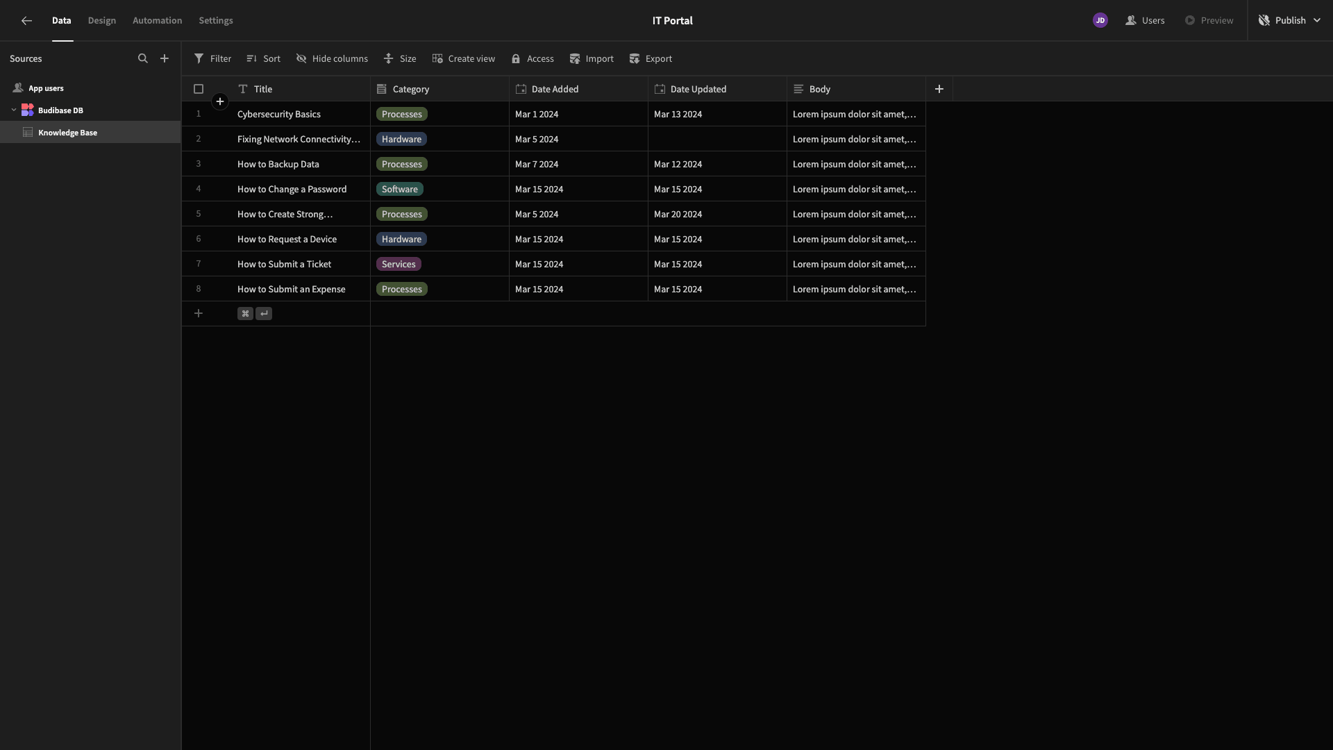
2. Building an index screen
Now, we can start building user interfaces for our IT portal. We’ll start by creating an index screen where users can view and search all of the articles in our knowledge base.
So, head over to the Design tab.
Here, we’ll be offered a few choices for how we want to create our first app screen - including using one of Budibase’s autogenerated layouts.

Today, though, we’re going to opt for a blank screen. When we choose that option, we’re asked to input a URL extension.
We’re going with /knowledge-base.

Next, we need to choose a minimum access role to view this screen. Budibase offers four hierarchical roles - Public, Basic, Power, and Admin.
For our portal, we’re only going to leverage two. Basic users will be able to search and view knowledge base articles, but Power users will also have the ability to edit, delete, or create content via additional screens.
So, we’re leaving this first screen set to the default option of Basic.
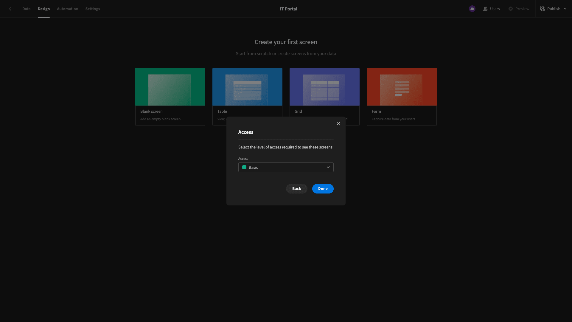
Here’s our blank screen.
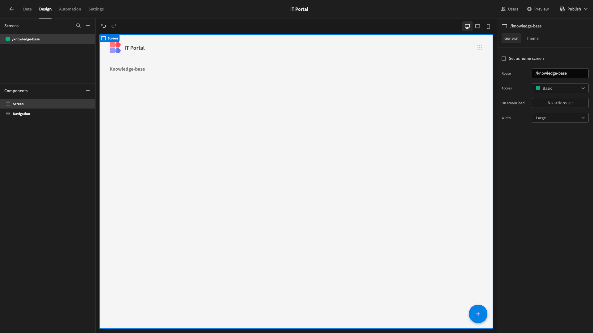
We can use the plus icon on the right-hand side to start adding components.
We’re going to start by adding a Cards Block. This is a preconfigured set of components that will iterate over a connected data table and display a configurable card for each entry.
Since our app only has one data table, this is already pointed at our Knowledge Base data.

Of course, we’ll need to make a few changes to this.
First, we want to configure the information that’s displayed on each individual card. Notice they have three pieces of display text - a title, subtitle, and description.
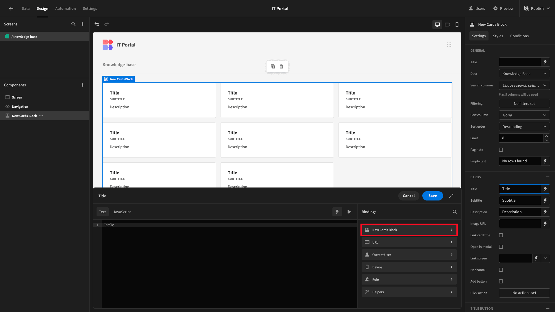
We bind each of these to relevant attributes from our database table. We’ll use the lightning bolt icon beside the Title setting to open its bindings drawer.

Here, we can access all of the data that our Cards Block is exposed to. We’ll click into the New Cards Block option to access the table we’ve pointed this at.
And we’ll choose the Title:
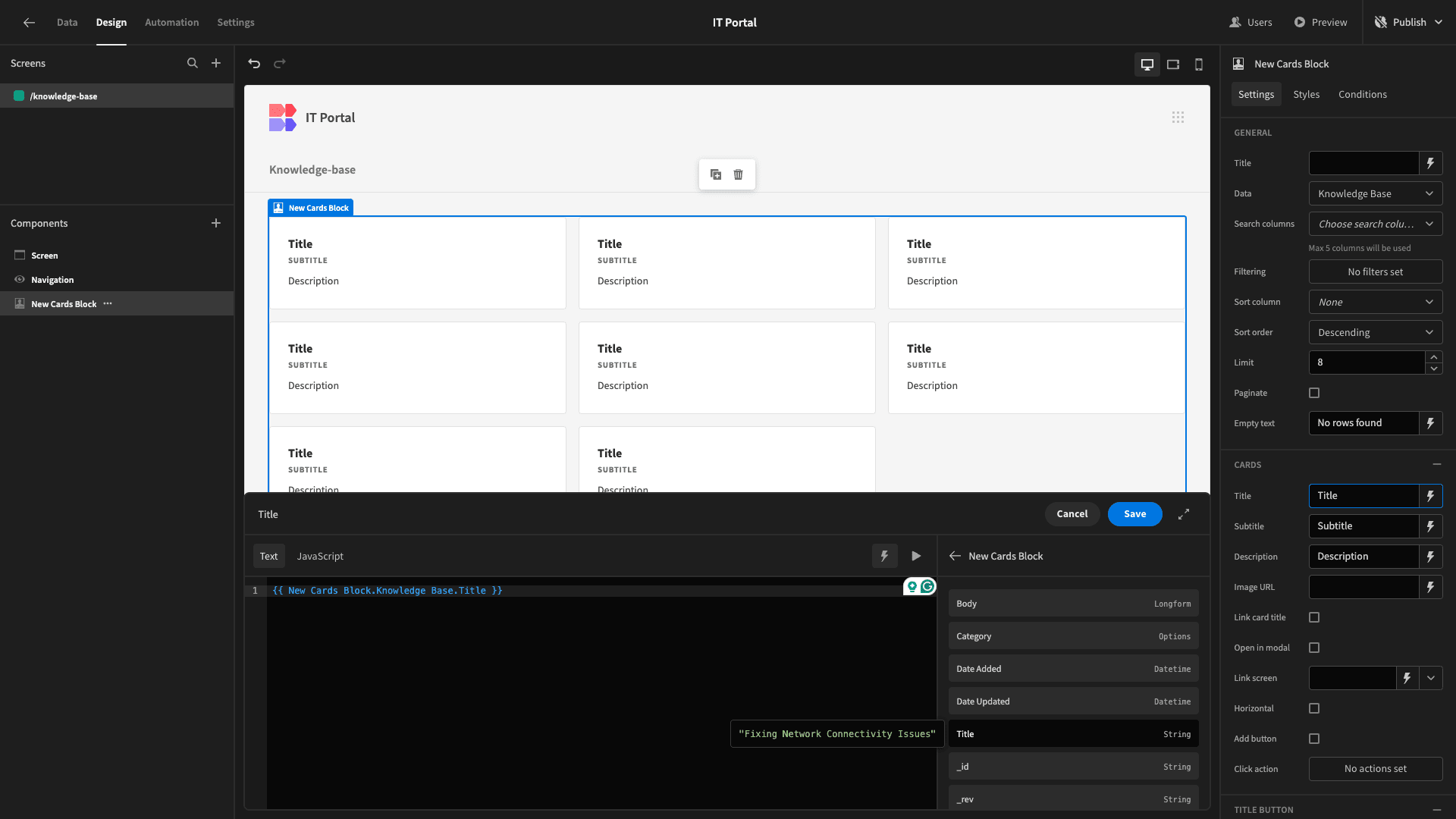
Here’s what our Cards Block looks like now.

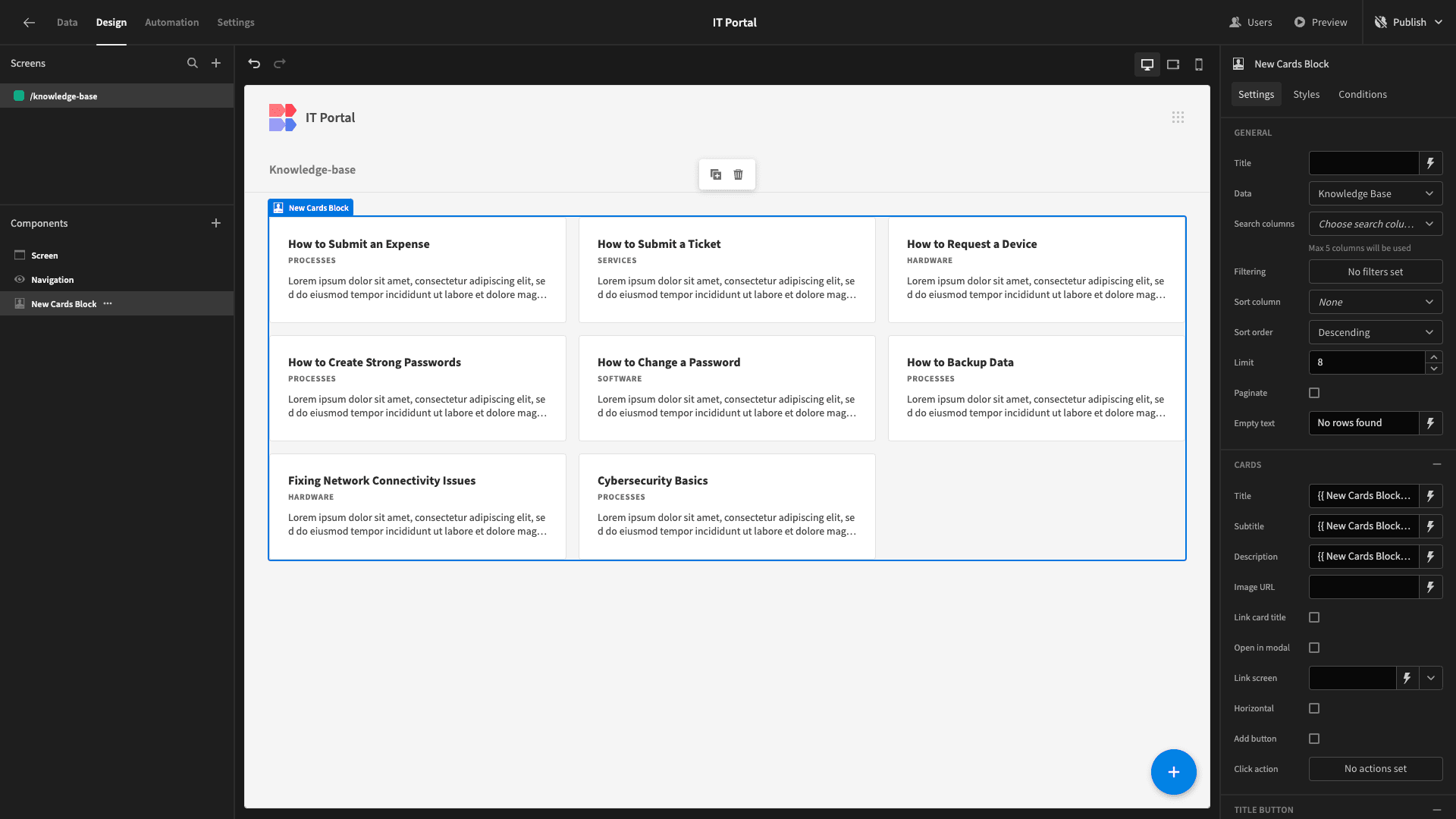
We’ll repeat this process to bind the Subtitle to the Category column and the Description to the Body of each article. This will be automatically truncated to only show the initial snippet.
Now we have this.
Eventually, we’ll make each card title clickable, allowing users to open up individual articles.
First, though, we need to make a couple more changes. These are adding searchability and then displaying a button that will enable Power users to access a form to create new articles.
Our Cards Block has a drop-down called Search Columns. We’ll open this and select Title and Category to add these as searchable fields.
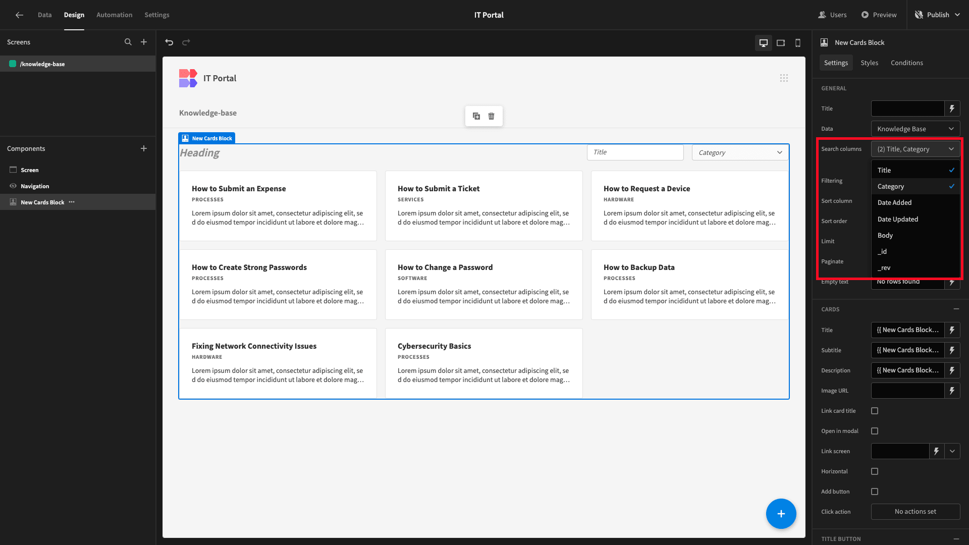
While we’re here, we’ll also populate the Title setting.
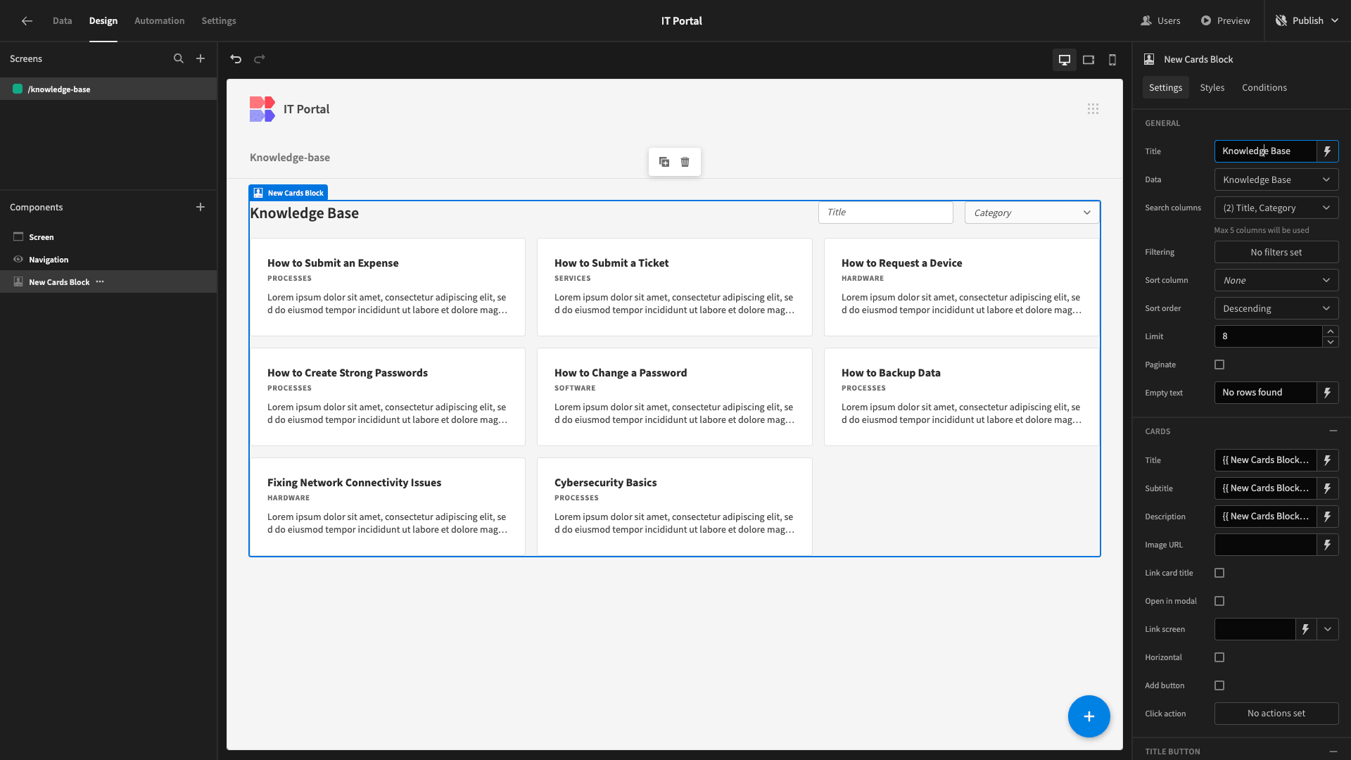
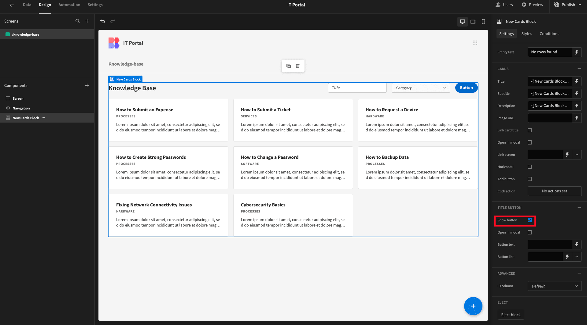
Adding a button to access a form for creating new rows is a little more involved - especially because we only want to display this to Power users.
We’ll start by enabling the Show Button setting under Title Button.
And we’ll set its text to Create New.
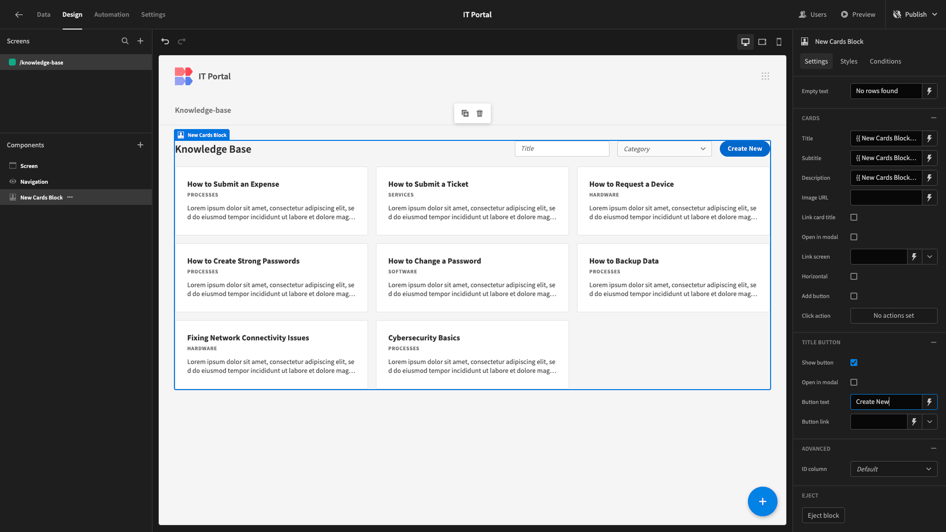
We’ll worry about what this button does a little later once we’ve built a form for creating new articles.
Next, we want to add a conditionality rule so that this button only appears for users with the Power role or higher.
Conditionality rules in Budibase allow us to easily display and hide components or update any of their native settings based on custom expressions.
We’ll start by opening the Conditions drawer for our Cards Block.
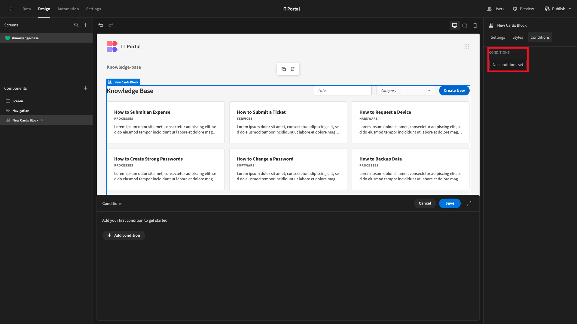
Then, we’ll add a rule to update our Show Button setting to disabled.
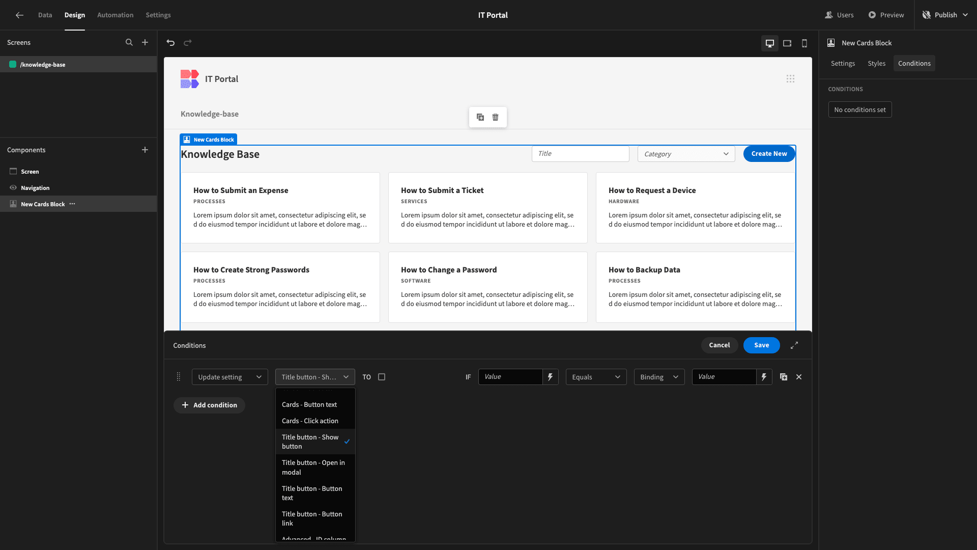
We’ll also need to populate a reference value and a comparison value to complete our rule.
So, we can open the bindings drawer for our first value and select Current User:
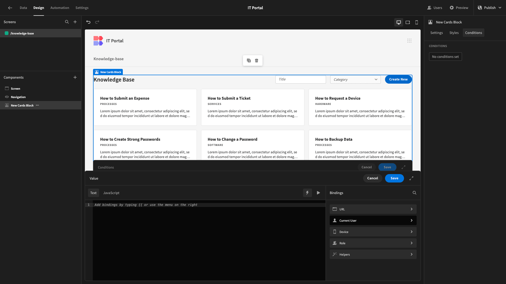
Followed by RoleID.
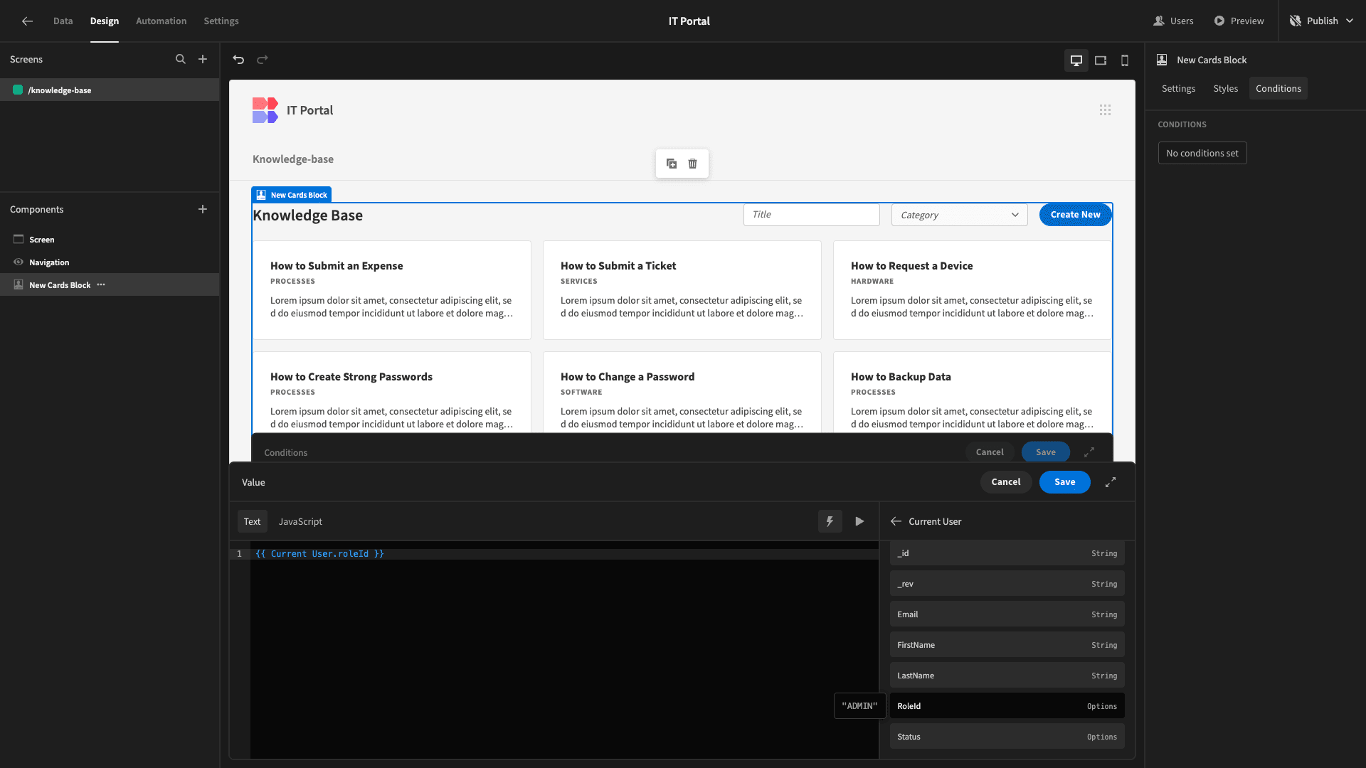
For the second value, we’ll choose Role.
And then Basic.

So, we’re hiding our button if the current user’s role equals Basic.
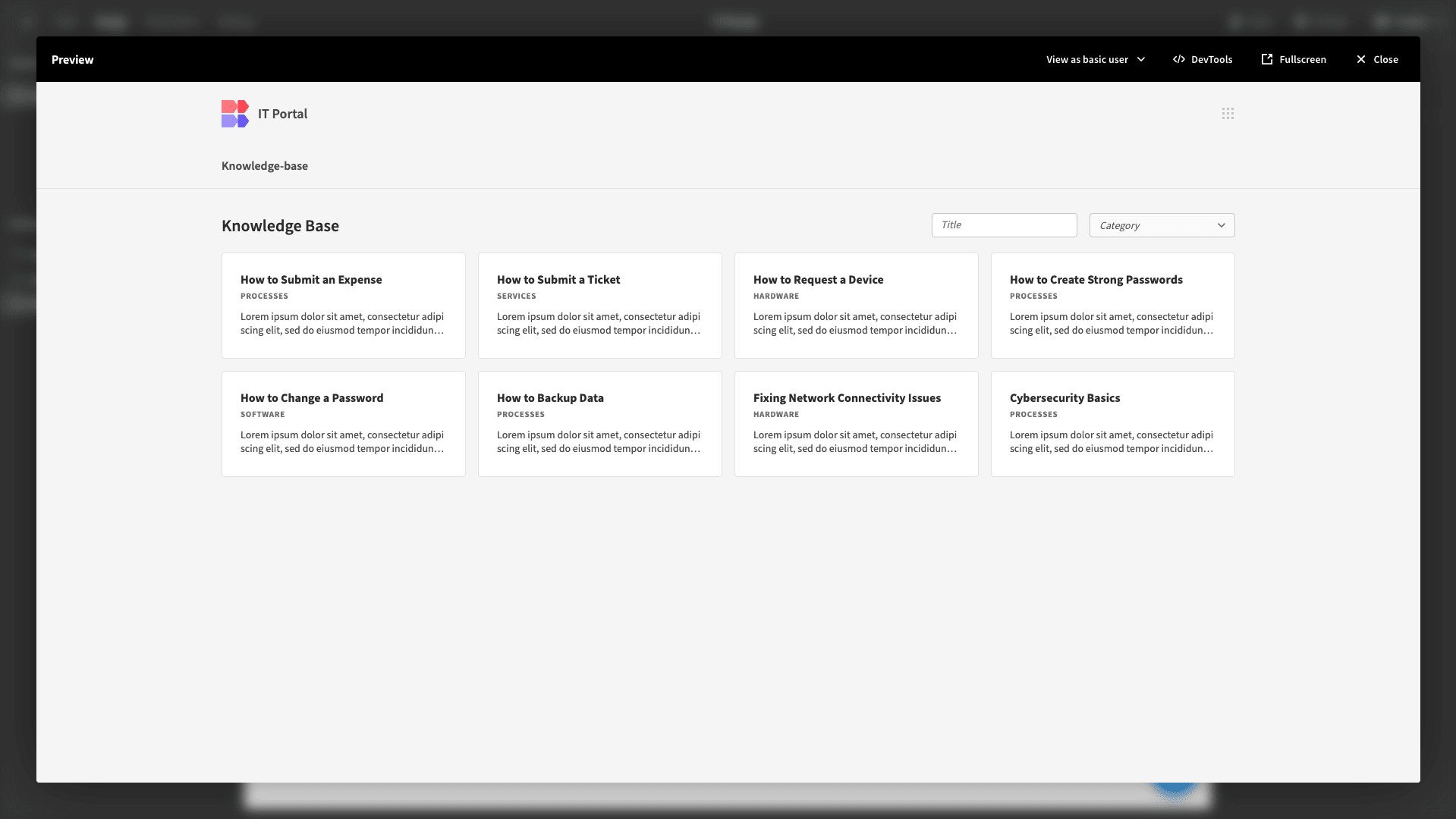
If we preview our app as a basic user, we can see that the button is hidden.
3. Viewing articles
Next, we want to start building UIs to interact with individual knowledge base articles. We’ll start by adding another blank screen, this time setting the URL to /knowledge-base/:id.
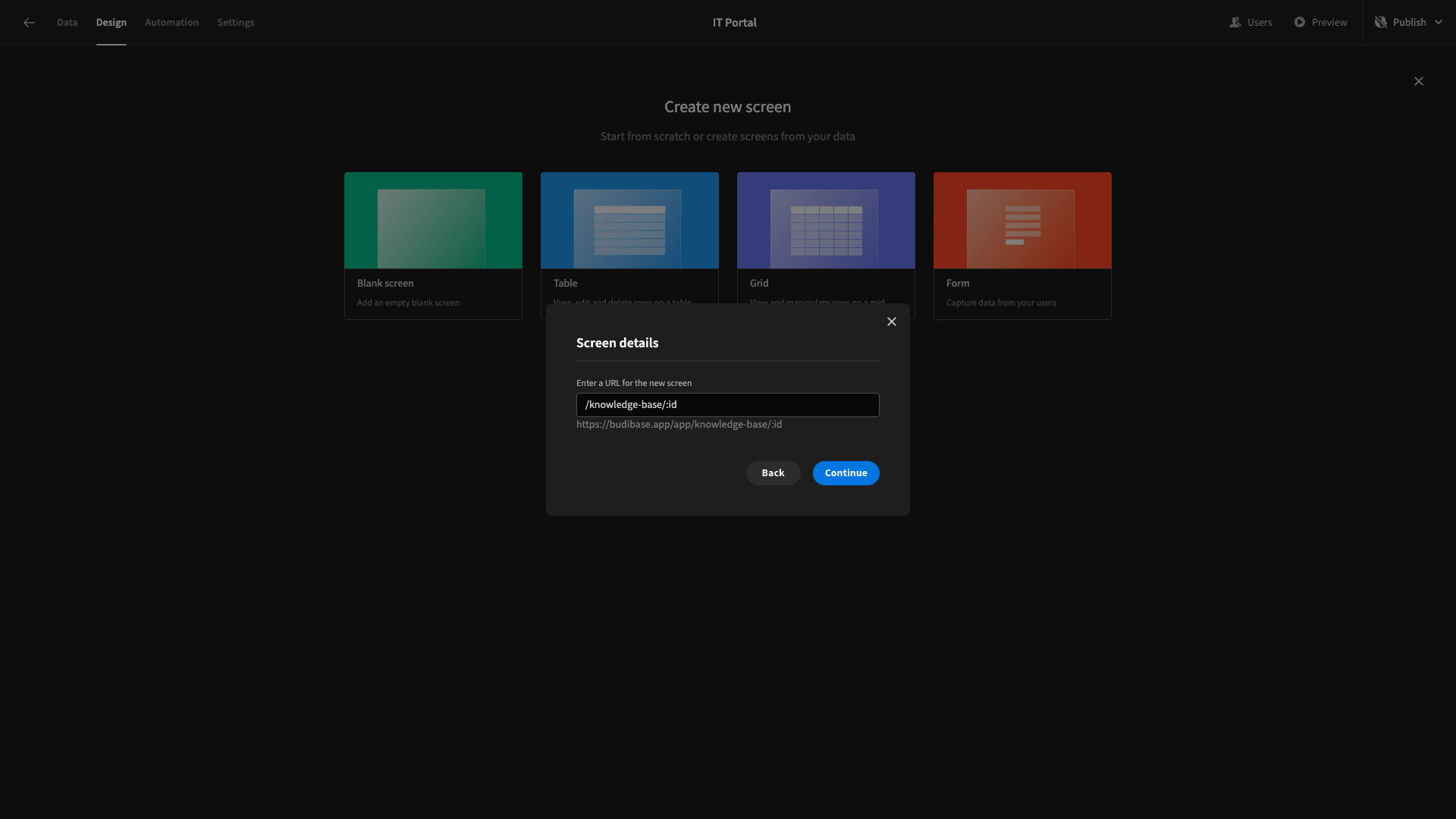
We can use :id as a URL extension to enable us to pass a variable between screens via their URLs.
Again, we’re going to set the minimum role for this screen to Basic.
This time, though, we’ll start by adding a Container and setting its horizontal alignment to the center.

Inside of this, we’ll add a Repeater Block. This connects to and iterates over a data source, exposing any components we nest within it to the stored values.
In other words, we can use the stored data as bindings for any components we place inside the Repeater Block.
However, we only want to display one row at a time, so we’ll need to add a filter to this based on the ID attribute we’re going to store in our URL.
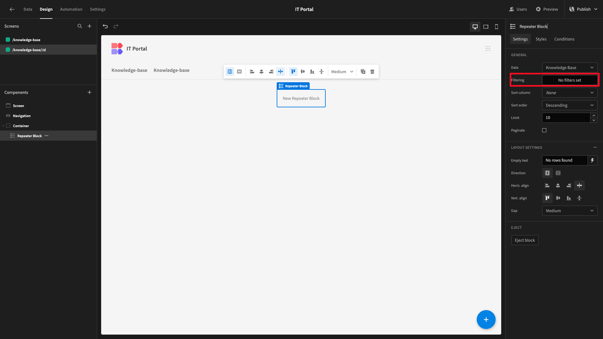
We’ll add a filtering expression based on the _id column in our database.
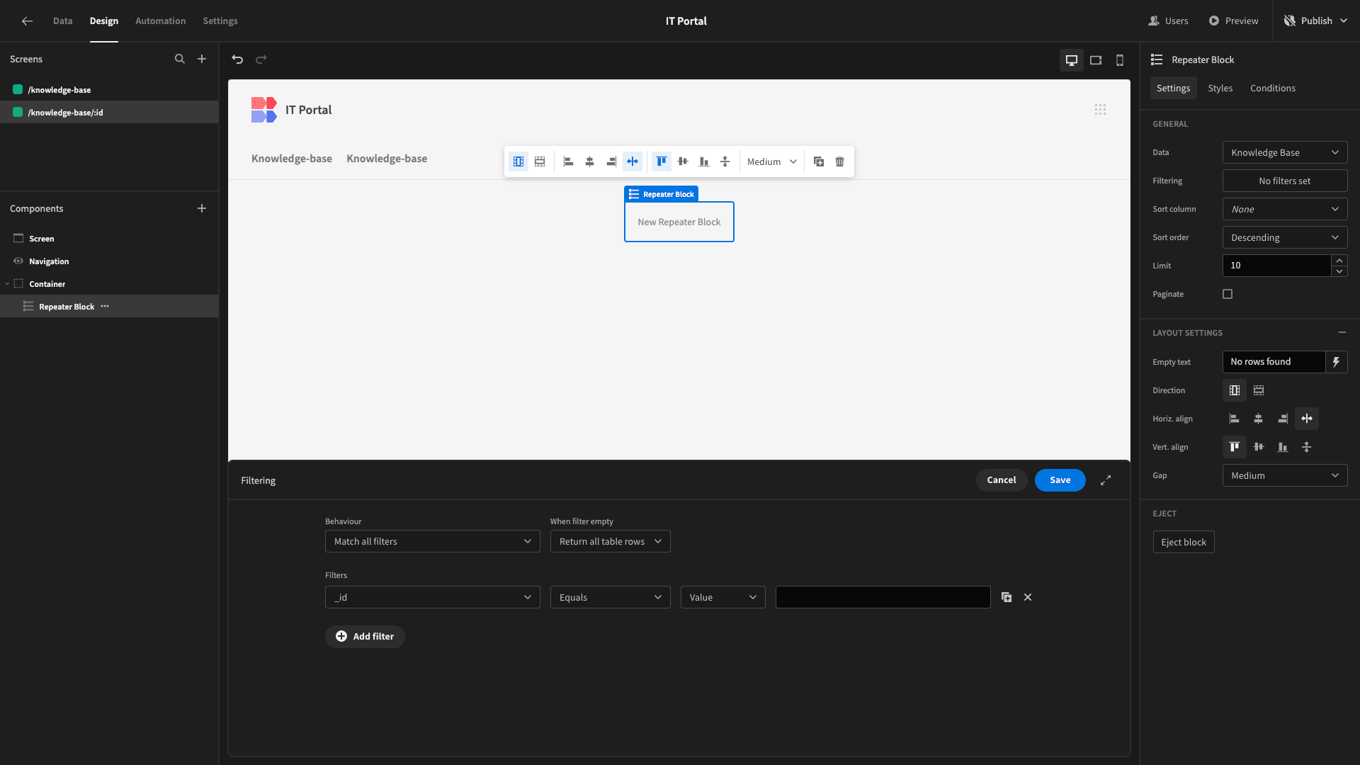
Then, we’ll bind this to {{ URL.id }}.
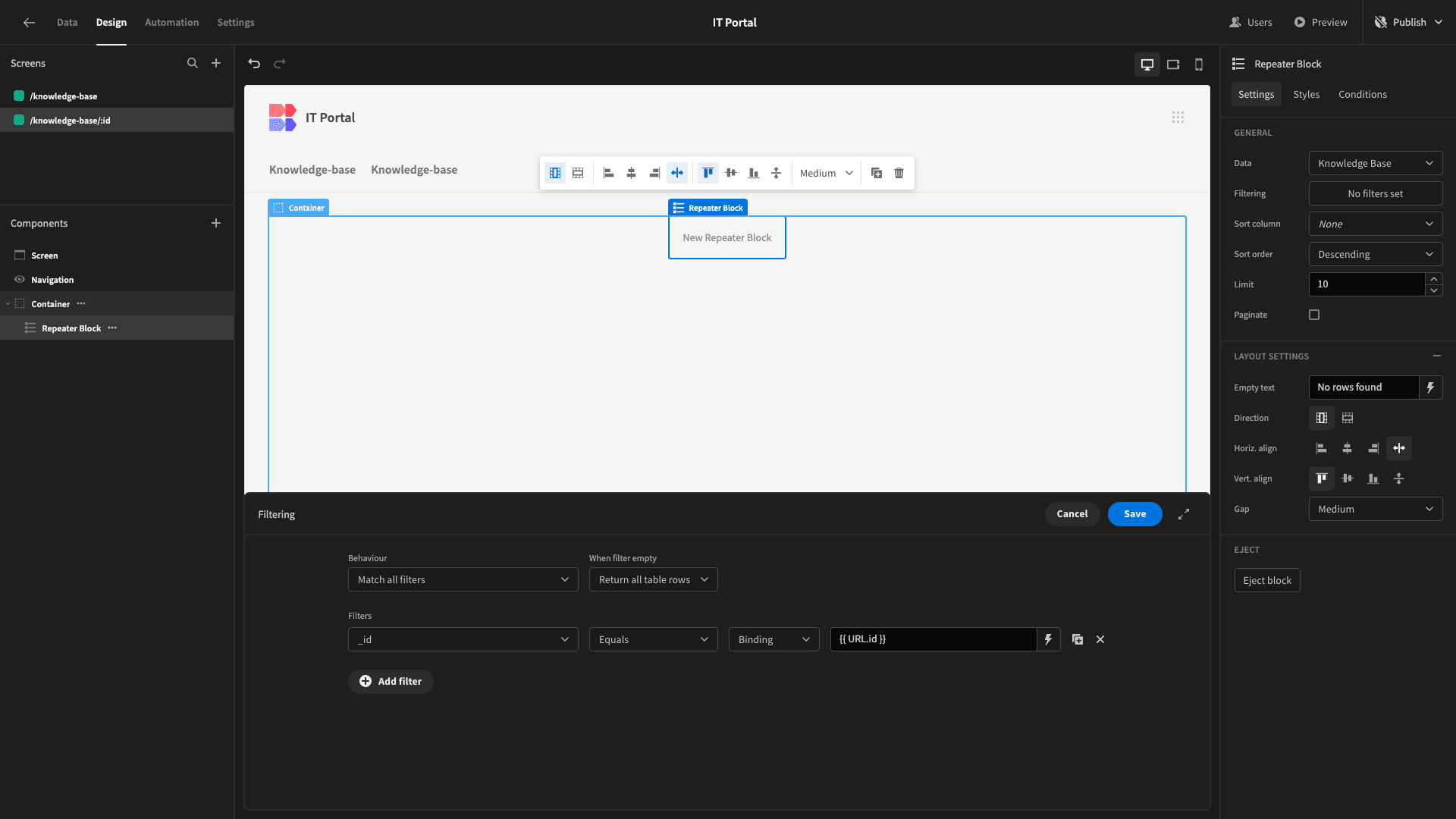
We’ll return to our index screen to assign a value to our URL ID in a few minutes.
Before we get to that, though, we want to design our UI to display individual articles.
At the top of the screen, we want to show the title, along with either the date it was created or last updated.
Beneath this, we’ll show the body of the article itself.
So, we’ll start by adding a second container within our Repeater Block, this time setting its direction to horizontal.
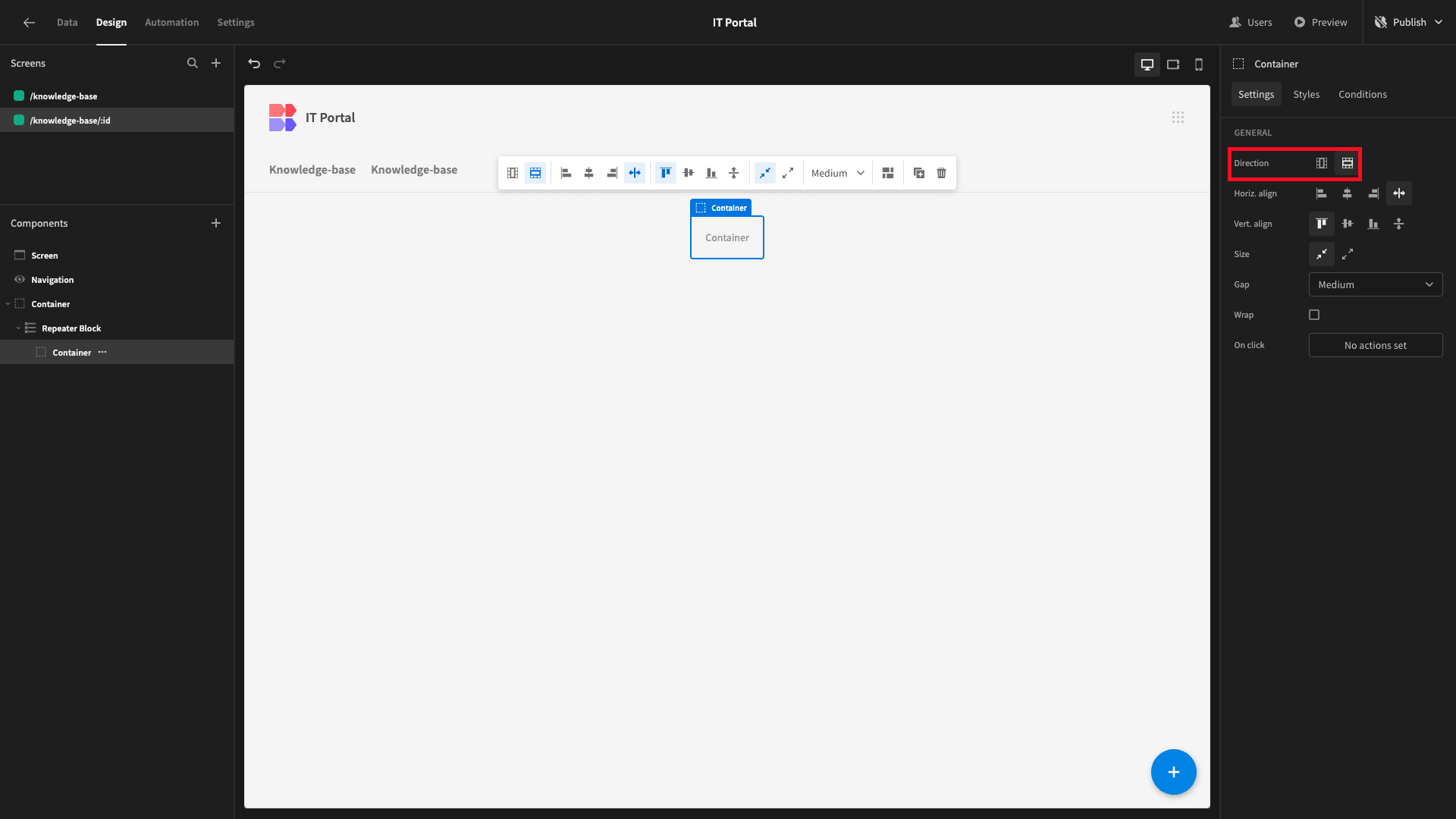
We’ll also give this a Width of 600px.
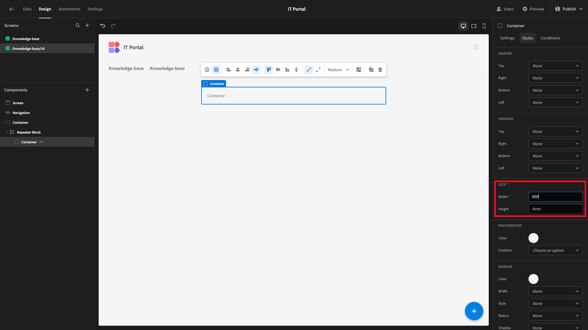
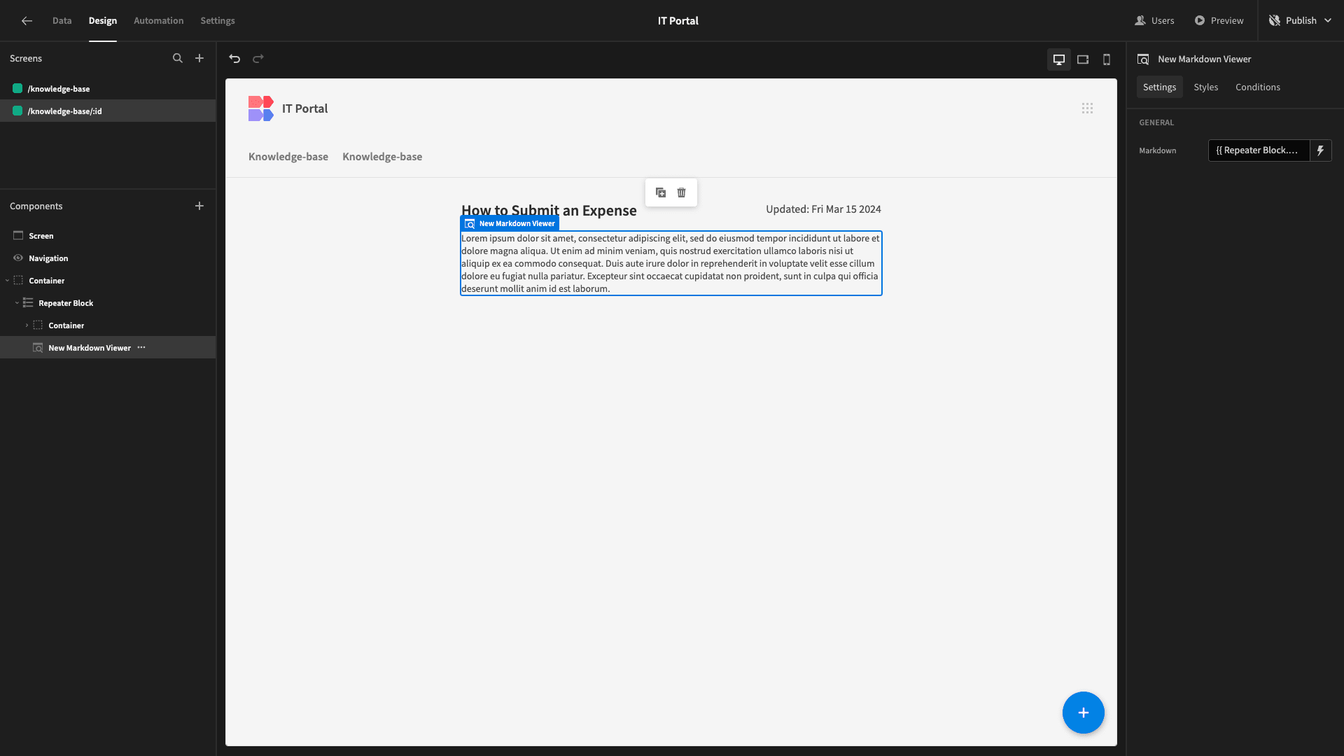
Within this, we’ll add a Headline component and bind its Text to our article’s Title column.

Beside this, we’ll add a Paragraph.
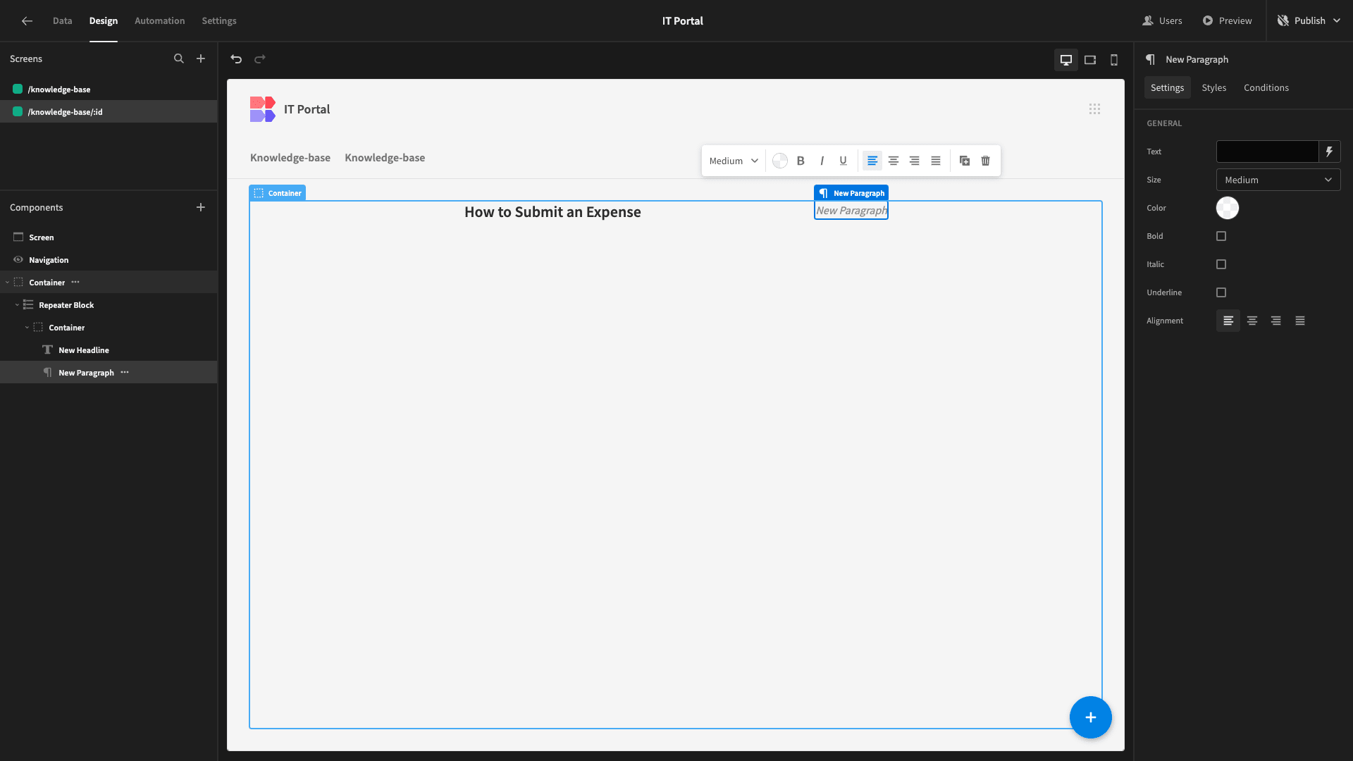
We want this to display either “Created:” or “Updated:” plus the relevant field.
To achieve this, we’re going to need a bit of custom JavaScript, so we’ll open the bindings drawer and select the JavaScript editor.
The specific code we’re going to use is:
 1var date = $("Repeater Block.Knowledge Base.Date Added");
 2
 3var text = "Created: "
 4
 5if ($("Repeater Block.Knowledge Base.Date Updated") != null){
 6
 7 var date = $("Repeater Block.Knowledge Base.Date Updated")
 8
 9 var text = "Updated: "
10
11}
12
13var formattedDate = new Date(date).toDateString();
14
15return text + formattedDate;
This uses an if statement to check if the Date Updated attribute is null and then displays the appropriate text and formatted date based on this.
We can use Budibase’s Live Evaluation feature to check that this works correctly.

When we’re happy, we’ll hit save.
Lastly, beneath our container, we’ll place a Markdown Viewer component, setting its text to our Body attribute and giving it a width of 600px.
Next, we’re going to head back to our index screen.
Under the Cards settings, we’re enabling Link Card Title and Open in Modal.
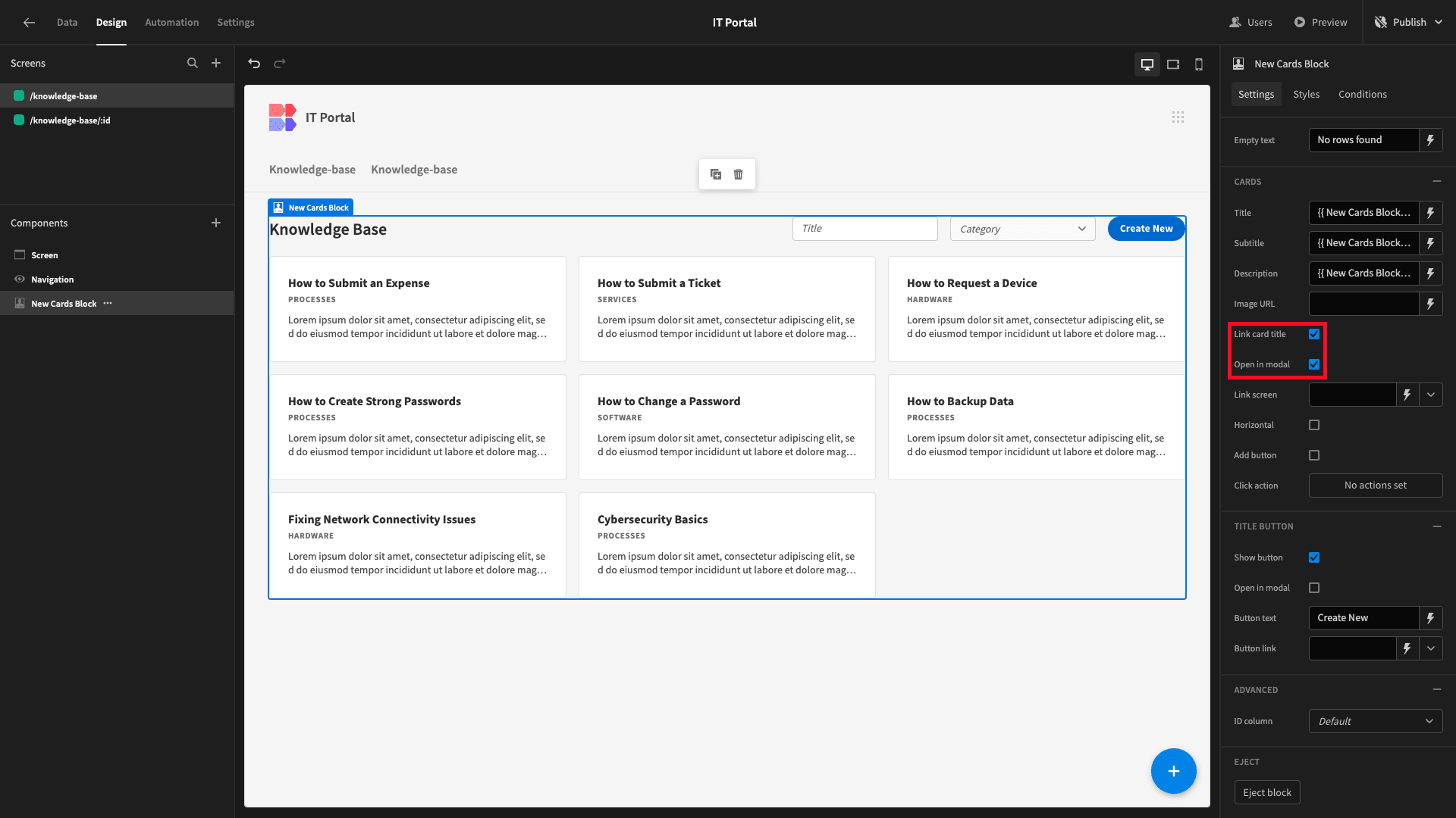
Lastly, we’ll bind our Link Screen field to /knowledge-base/{{ New Cards Block.Knowledge Base._id }}, populating our URL ID variable with the relevant row ID from our repeaters block. This will then be used in our filtering expression from earlier.
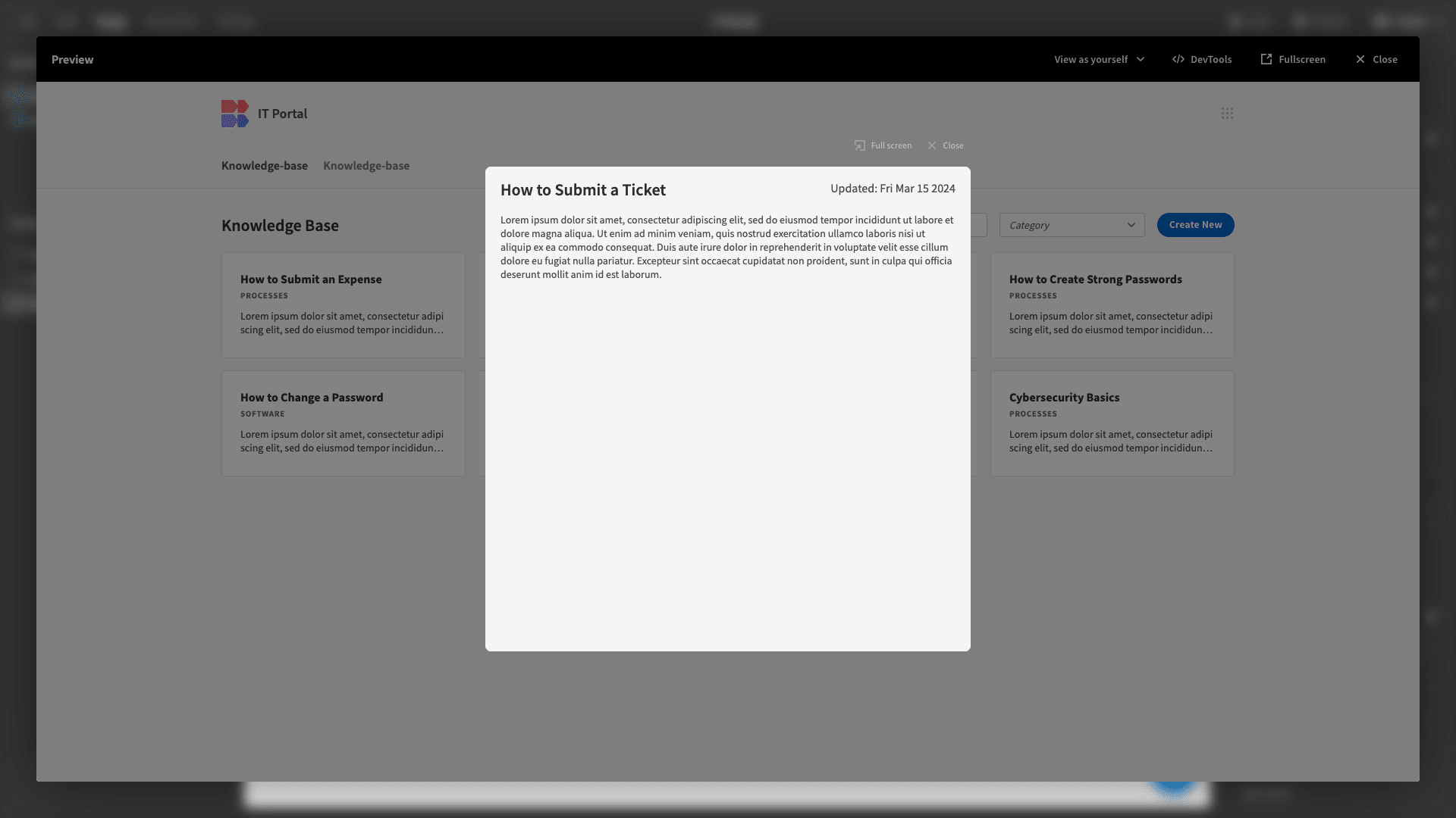
Now, if we open a card, it will look like this:
4. Adding admin functions
The last thing we need to do for the knowledge base side of our IT portal is add two forms for Power users to create or update articles.
We’ll start with the create form since this is a little easier.
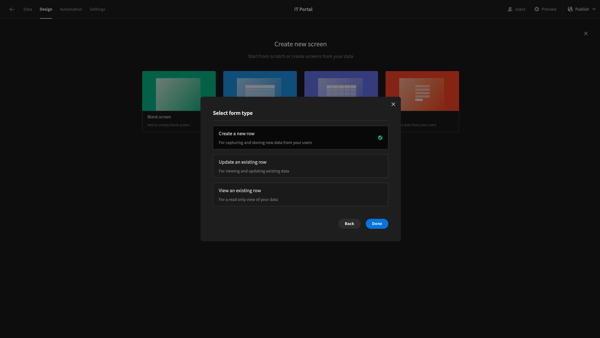
Once again, we’ll add a new screen - only this time, we’re selecting the prebuilt Form layout. We’re then asked which data table we want to point this at.
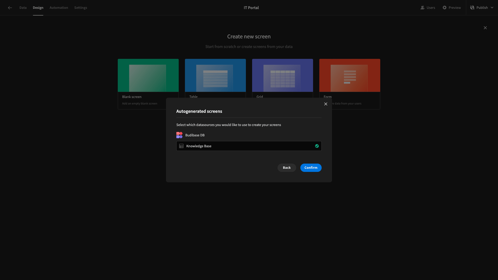
And what type of form we want to create. We’re choosing Create a new row.
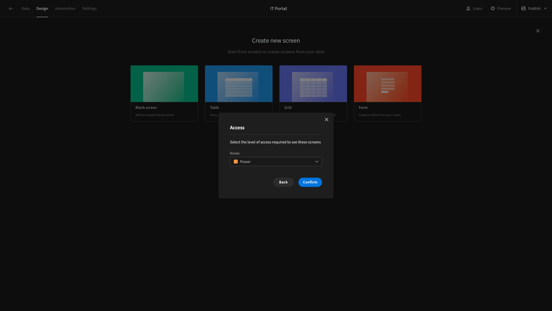
This time, we’ll set the minimum role to Power.
Here’s what this will look like by default.
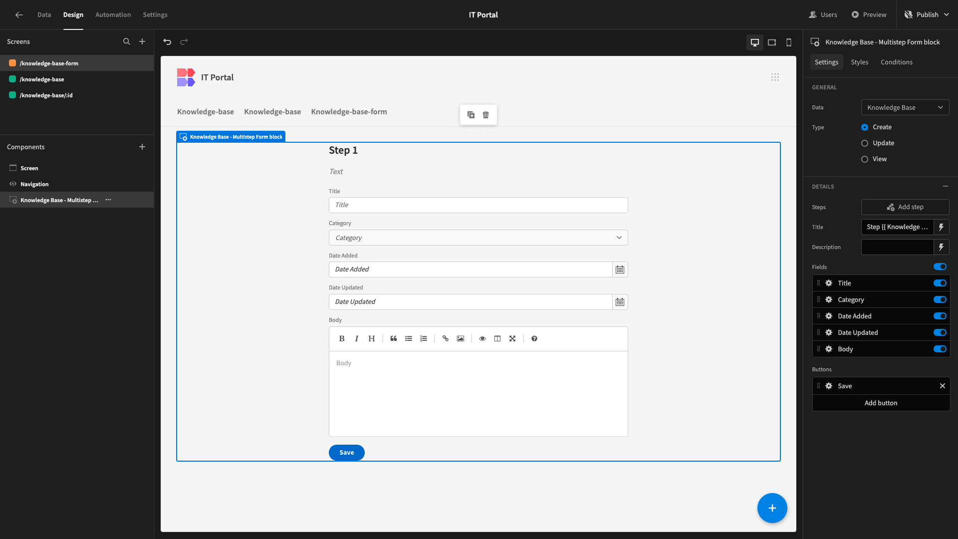
The Form layout generates a multistep form, but we’re only going to use a single step today.
All we need to do is configure how we want our fields to appear and make a couple of other design tweaks.
First, we’ll deselect the Date Updated field, since we have no need for this when we first create an article.
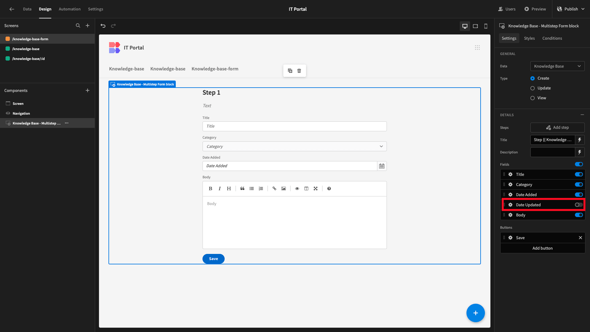
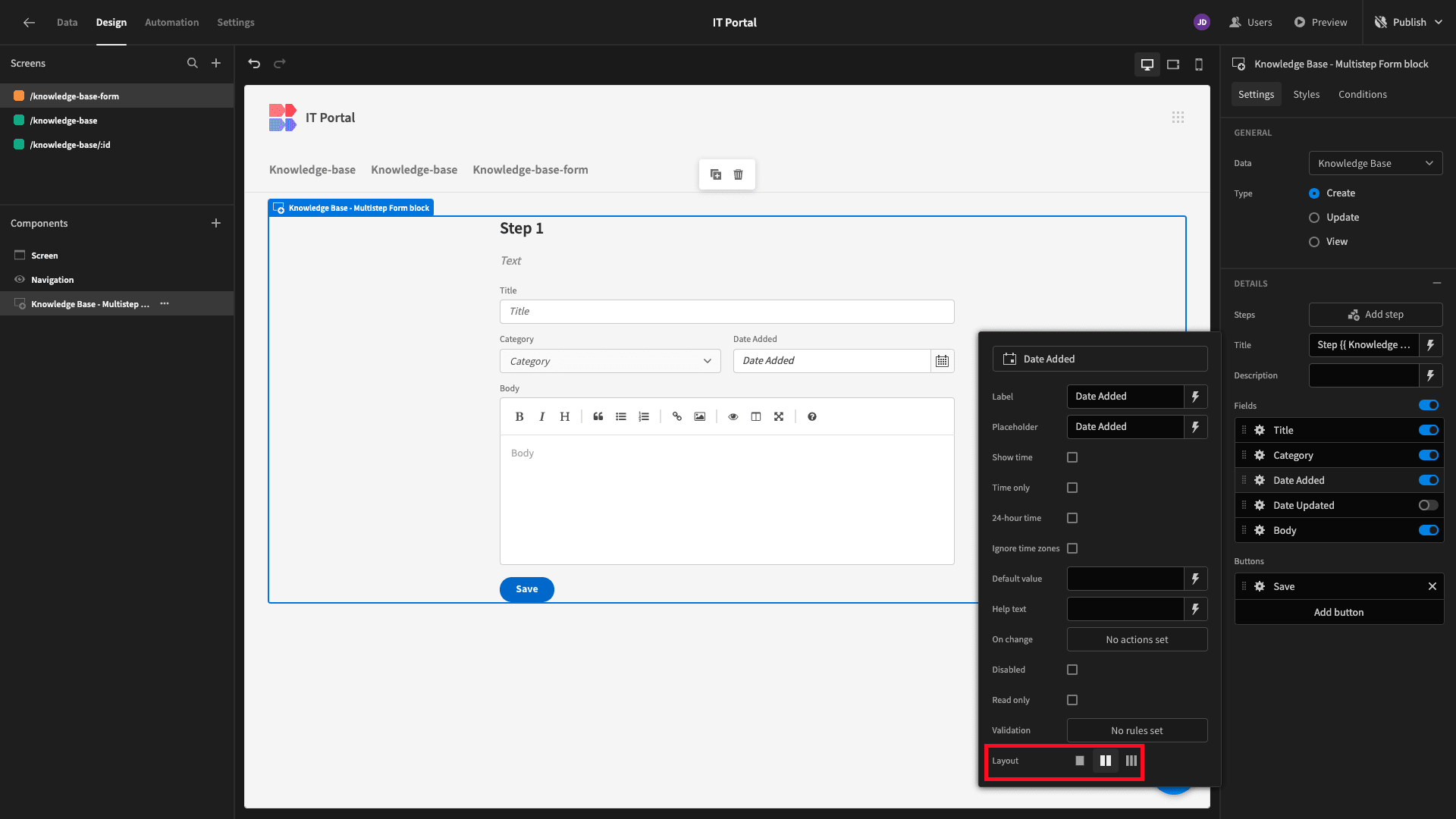
Then, we’ll use the layout setting on the Category and Date Added fields to arrange them into columns.
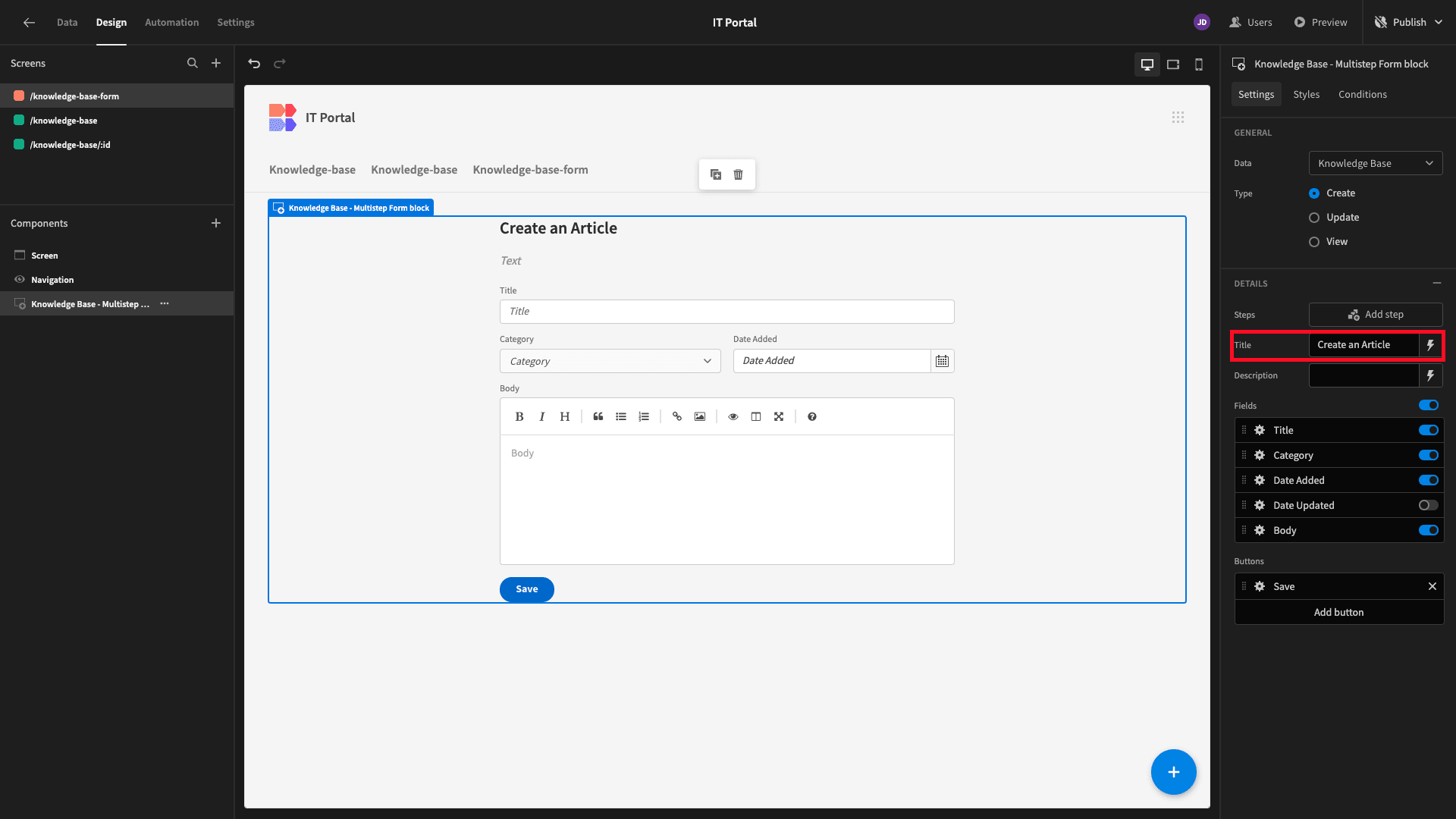
Since this is a single-step form, we can update the display title to something more appropriate.
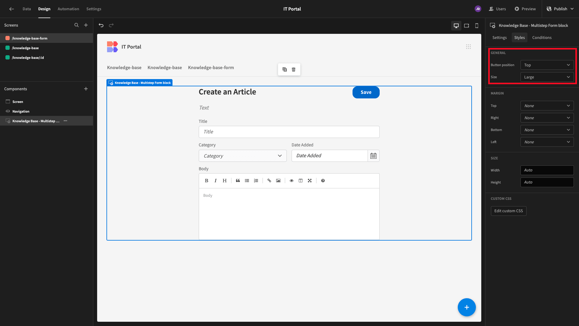
Then, under Styles, we’ll set the Size to Large and the Button Position to Top.
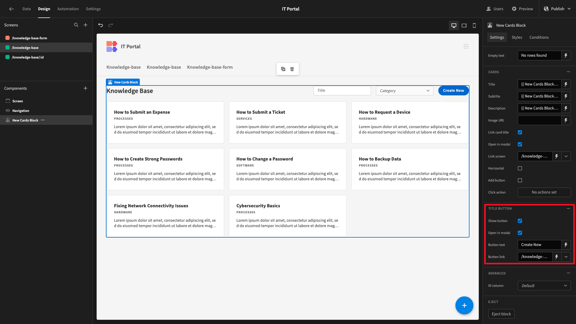
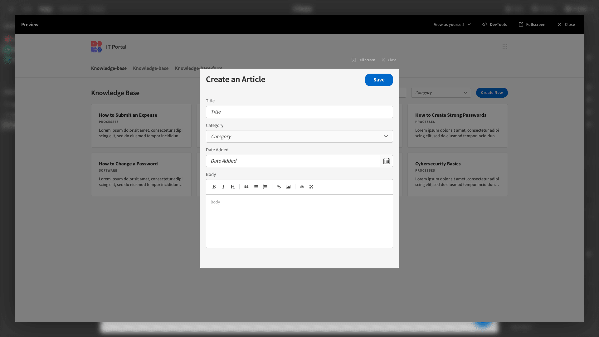
Back on our original screen, we’ll set the link for our button to our new URL, as well as selecting the option to open this in a modal.
Here’s what this will look like in our app preview.
Next, we want to create a similar form for updating entries.
We can start by duplicating the form screen we’ve just built. We’ll be asked to input a URL for this. We’re going with /knowledge-base/:id.
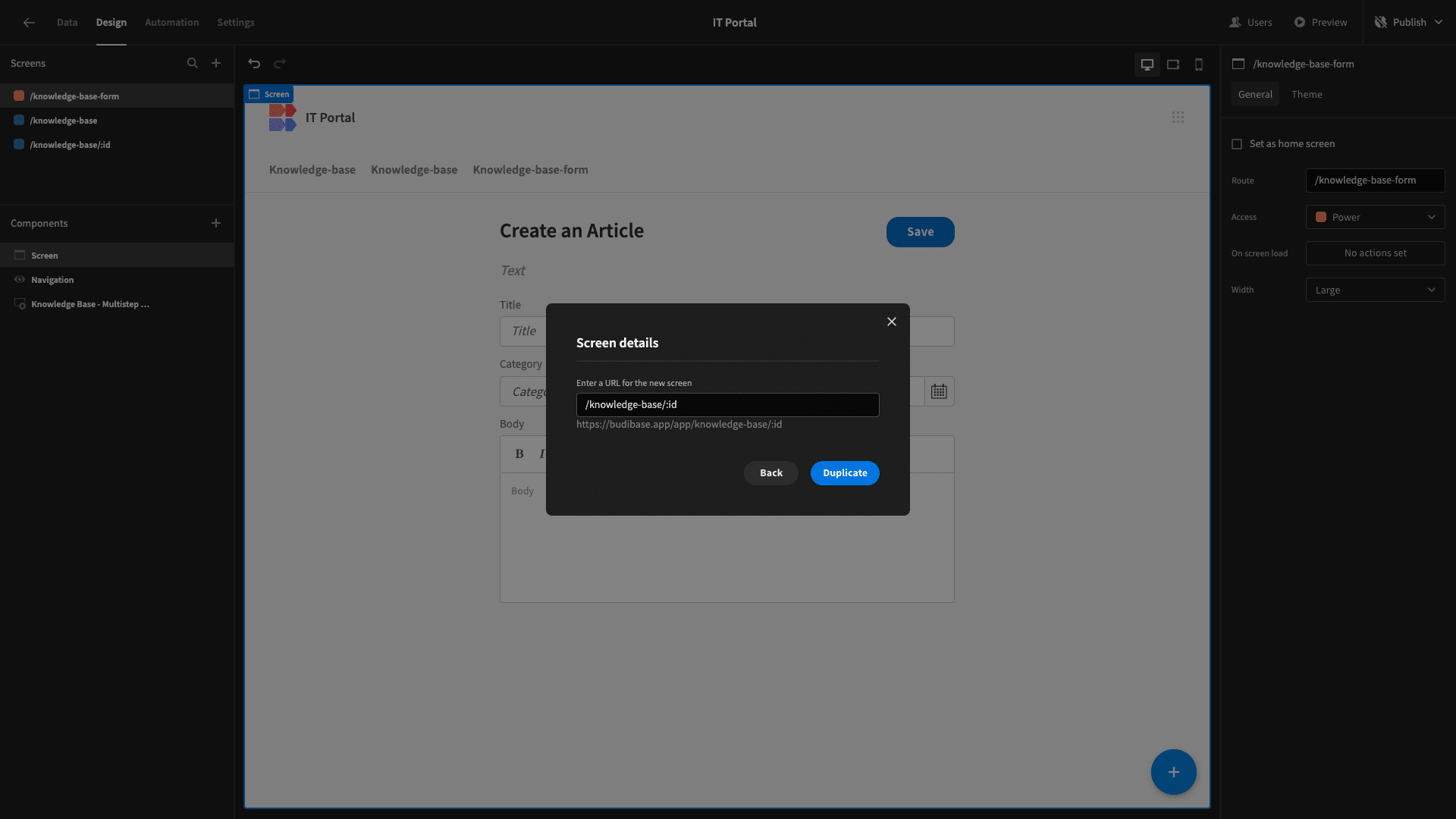
We can reuse this URL because the new screen will have a different role to the one that shares this. When a Power user navigates to this address, they’ll be brought to our new screen, but Basic users will still be directed to the old one.
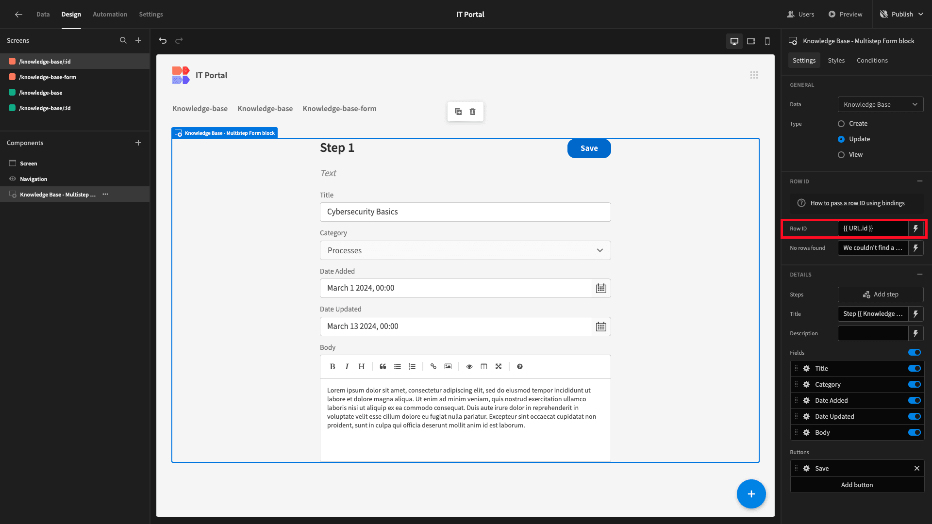
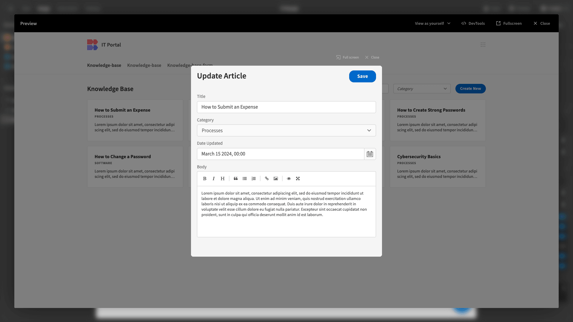
We’ll start by changing the type of our new form to Update.

Then, we’ll set the Row ID to {{ URL.id }} so that the appropriate row is retrieved and updated.
Then, we’ll deselect the Date Added attribute and update our display title.
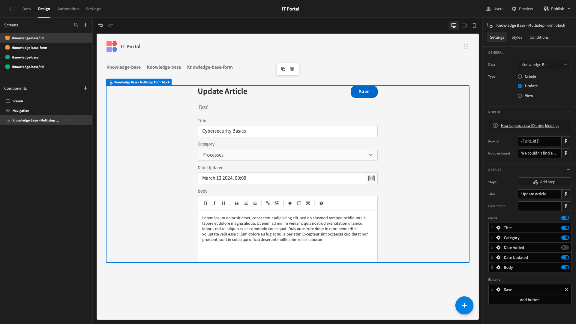
Now, when a Power user clicks on one of our cards, they’ll see this update form.
And that’s the knowledge base portion of our IT portal ready to go.
5. Creating a data table for support tickets
So, we can start building our IT portal’s other functionality - a basic ticketing system for issues that fall outside of what’s covered in our knowledge base.
Just like before, we need to start by creating our data model.
So, we’ll add a second table, which we’ll call Tickets.
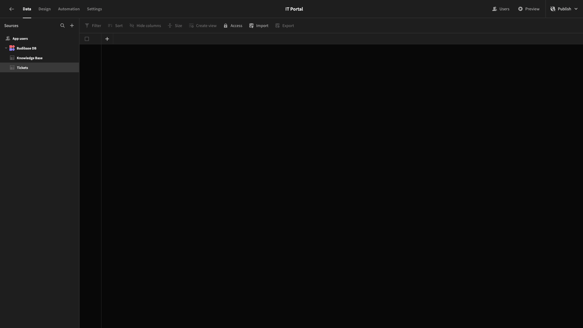
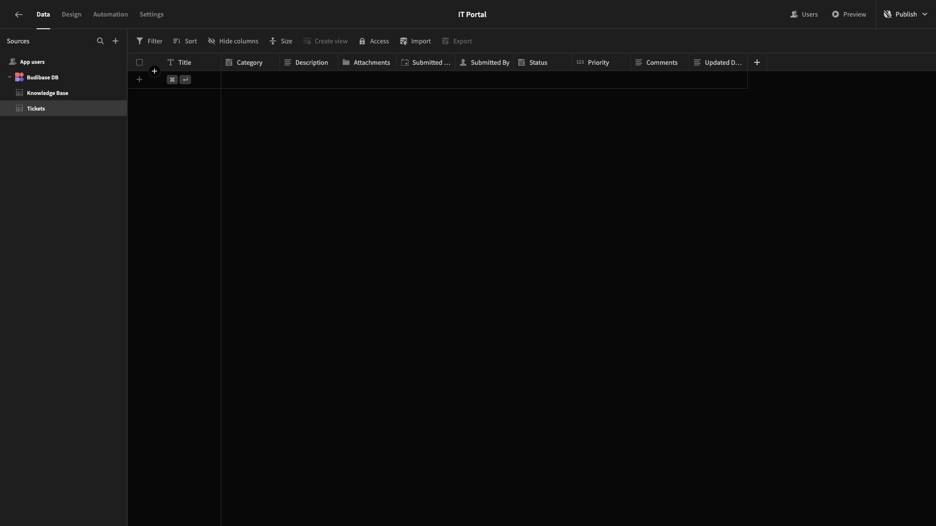
The attributes we’re going to add are:
- Title - text,
- Category - options,
- Description - long-form text,
- Attachments - attachment,
- Submitted Date - date,
- Submitted By - user,
- Status - options,
- Priority - number,
- Comments - long-form text,
- Updated Date - date.
The first six will be used when a ticket is submitted, and the remainder will be used as part of the response process.
Just like before, we’ll need to populate the options for our options fields. So, for Category, these will be:
- Hardware,
- Software,
- Support,
- Process.
For Status, we’ll use:
- Submitted,
- Resolved,
- In-Progress,
- Closed.
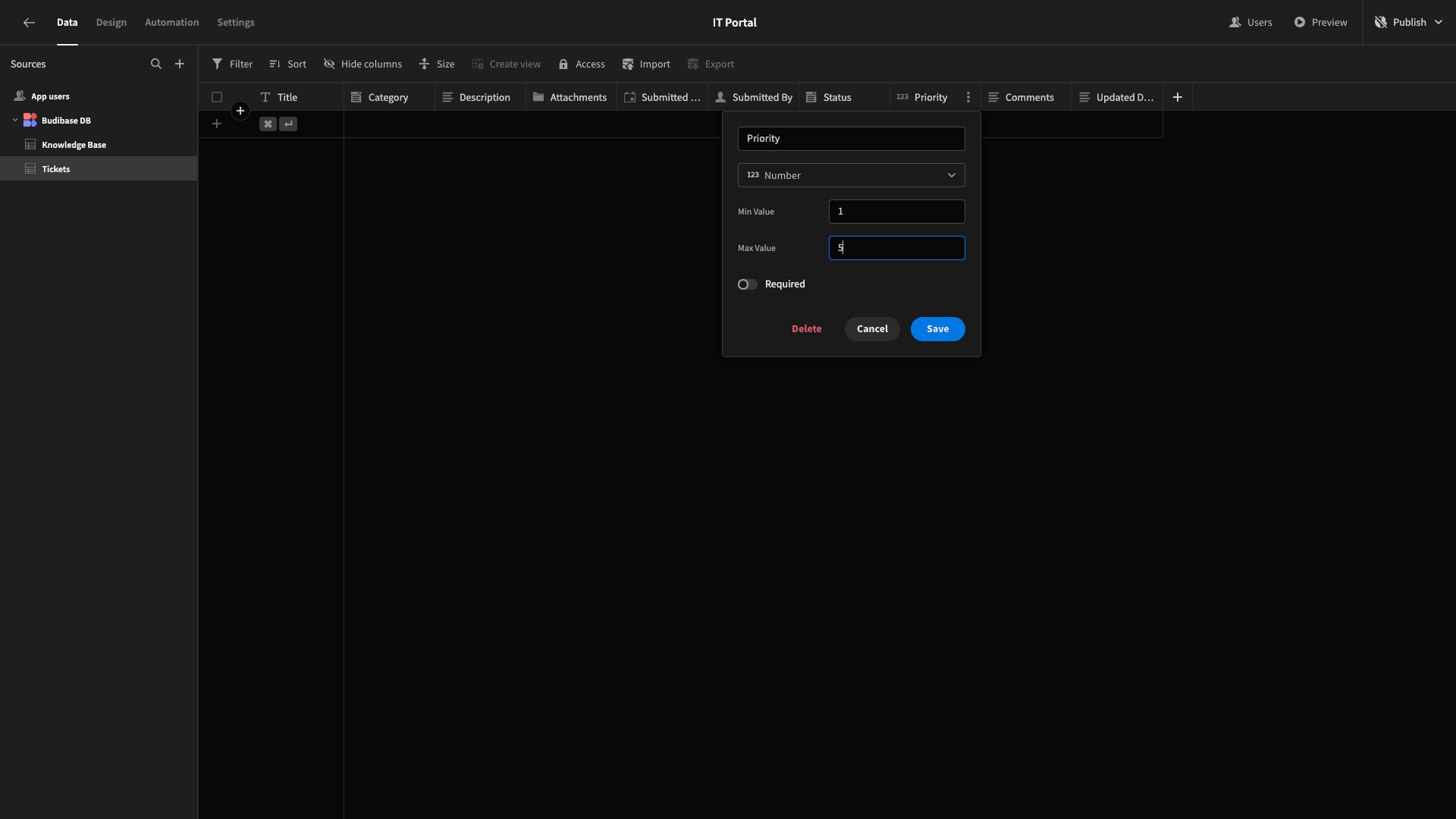
We’ll also add a maximum and minimum value to our Priority attribute, so users can only add a value between 1-5.
Now, we can move on to building our UIs.
6. Building our ticketing form
This time, we’ll start with our form for submitting a ticket.
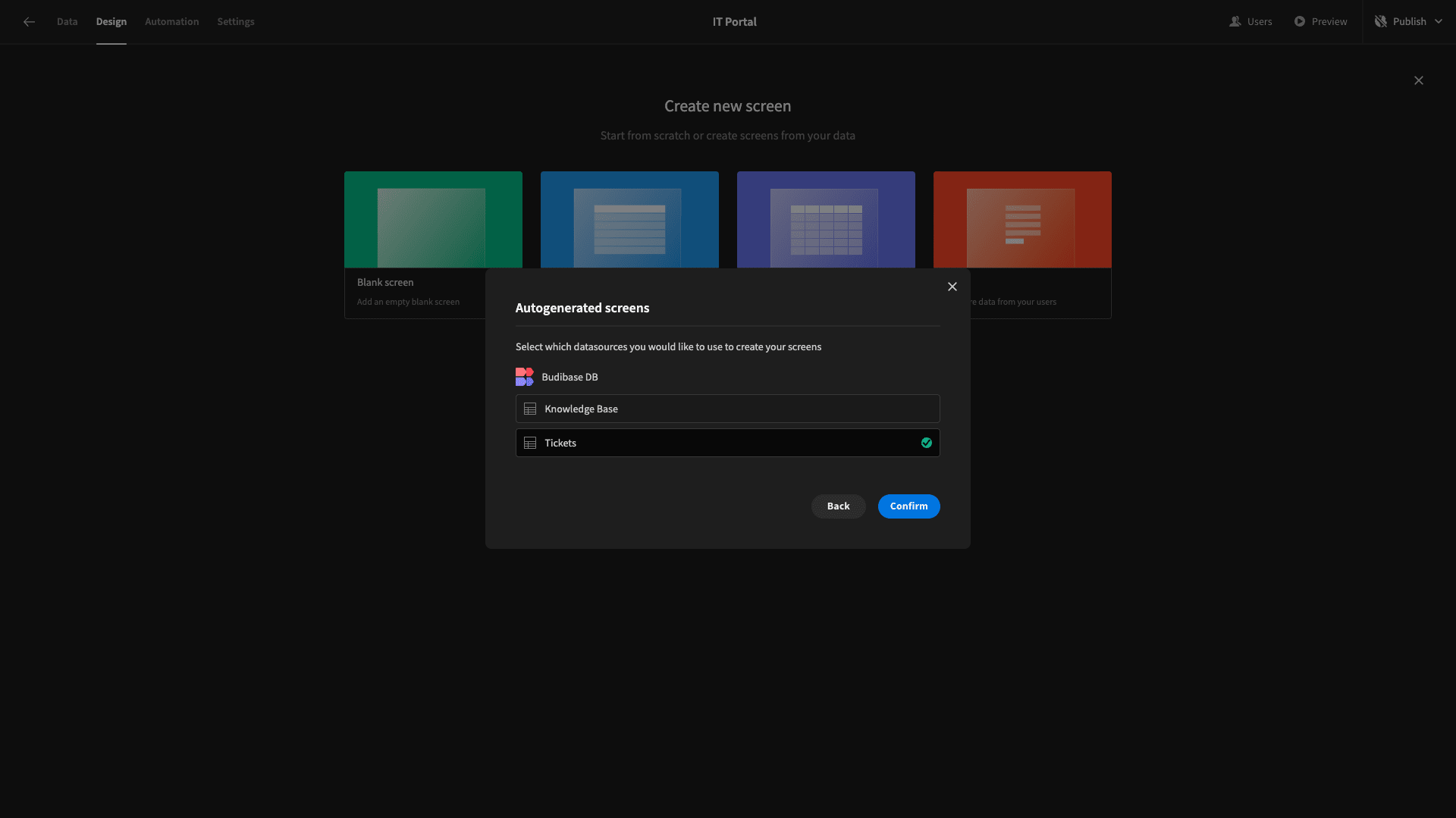
Once again, we’ll add a new screen with the Form layout, this time choosing our Tickets table. We’ll set the form type to Create and the minimum role to Basic.
Here’s what we have.
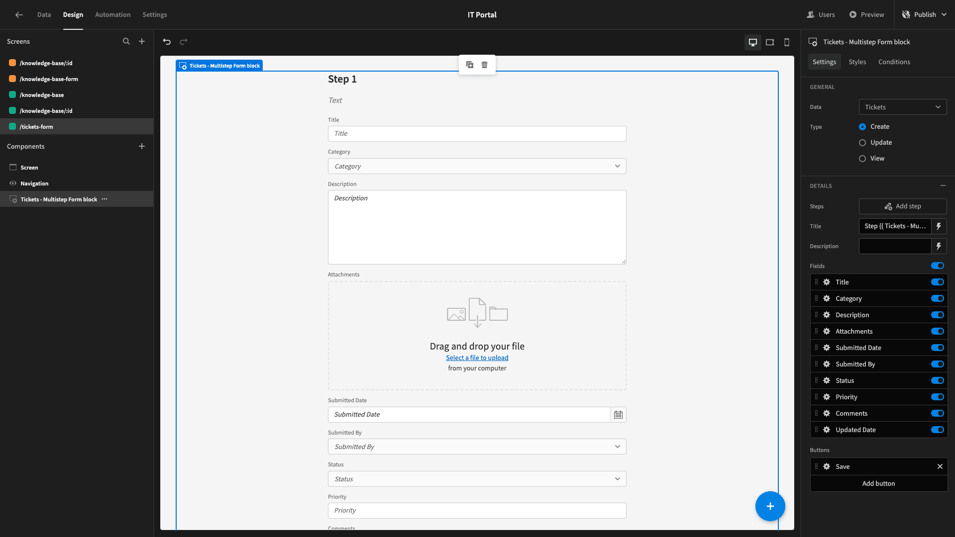
This form is going to be a little different from our previous examples. There will be some fields that will be populated with user inputs, but some will have values assigned automatically, and others will be left out until later when our ticket has a response.
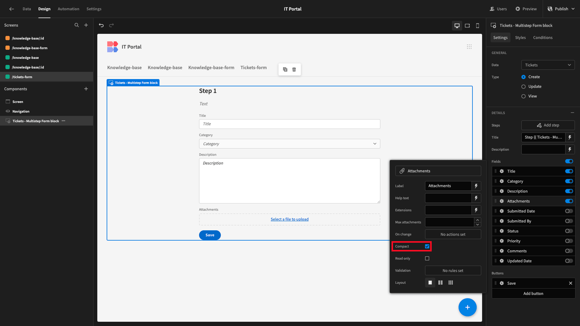
So, we’re going to deselect everything except Title, Category, Description, and Attachments.
We’ll then set the Attachments field to compact to make better use of the space.
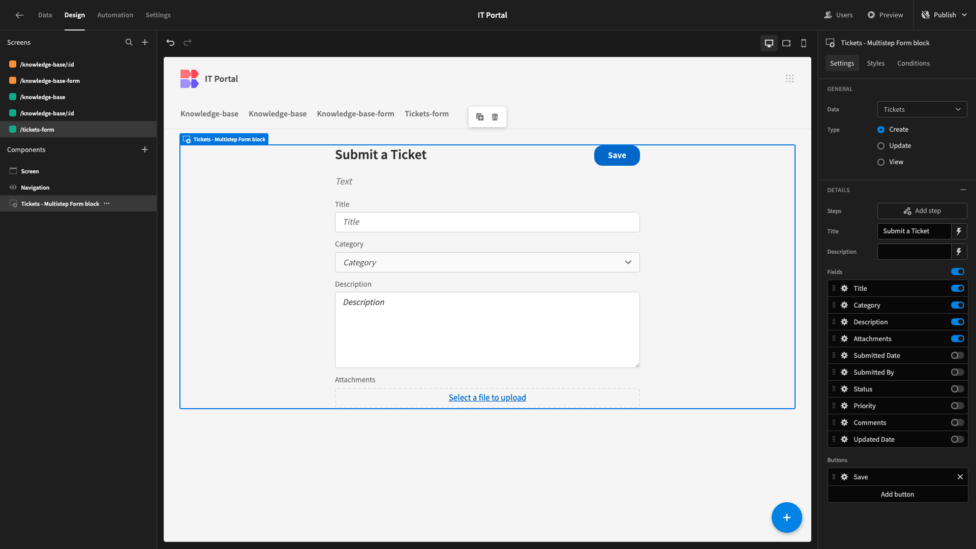
Then, just like before, we’ll update our title, Size, and Button Position settings.
There are three fields that we want to assign value to without user inputs - Submitted Date, Submitted By, and Status.
We can do this by opening the drawer to activate our Save button. Under the Save Row action, we can manually add columns.

For Status, we’ll simply enter Submitted as a string.

We’ll set Submitted By to {{ Current User._id }}.
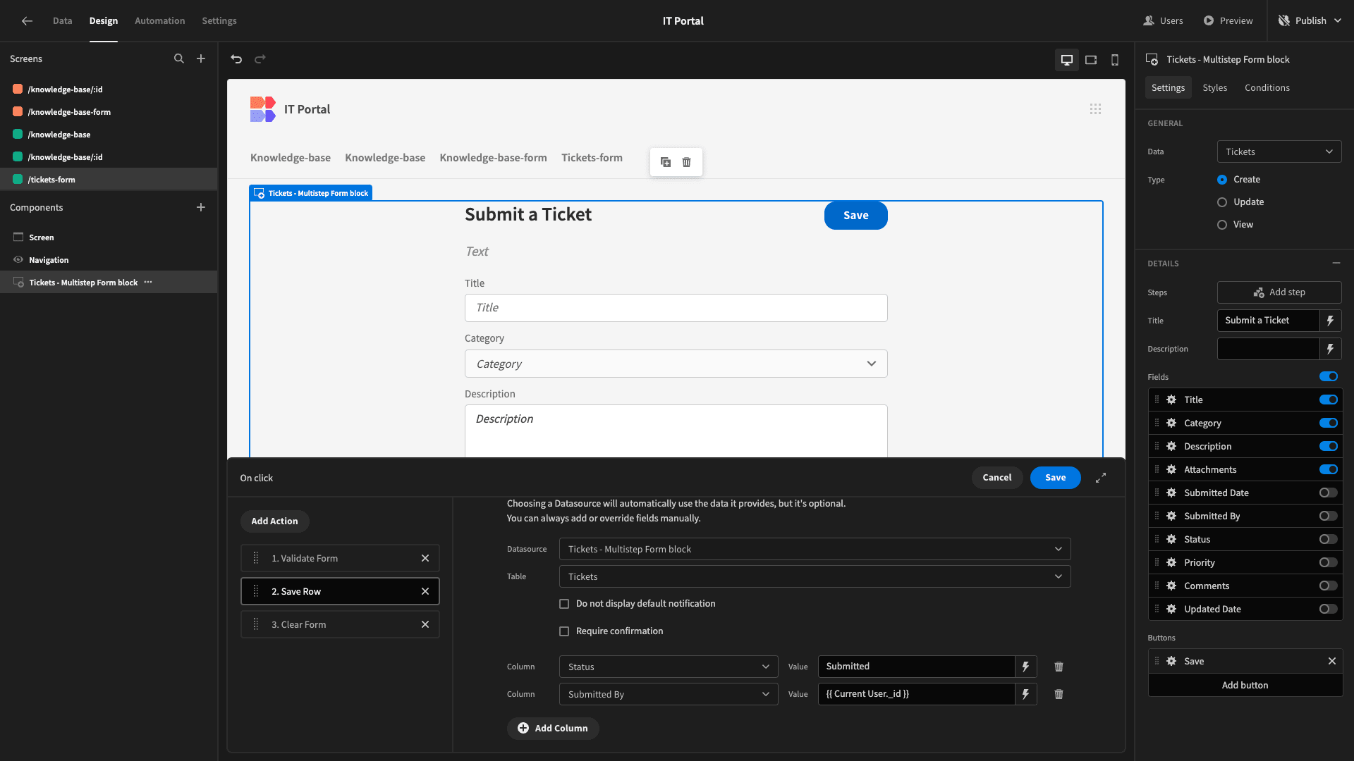
Lastly, we’ll set the Submitted Date to the following JavaScript expression.
1var date = new Date();
2
3return date;
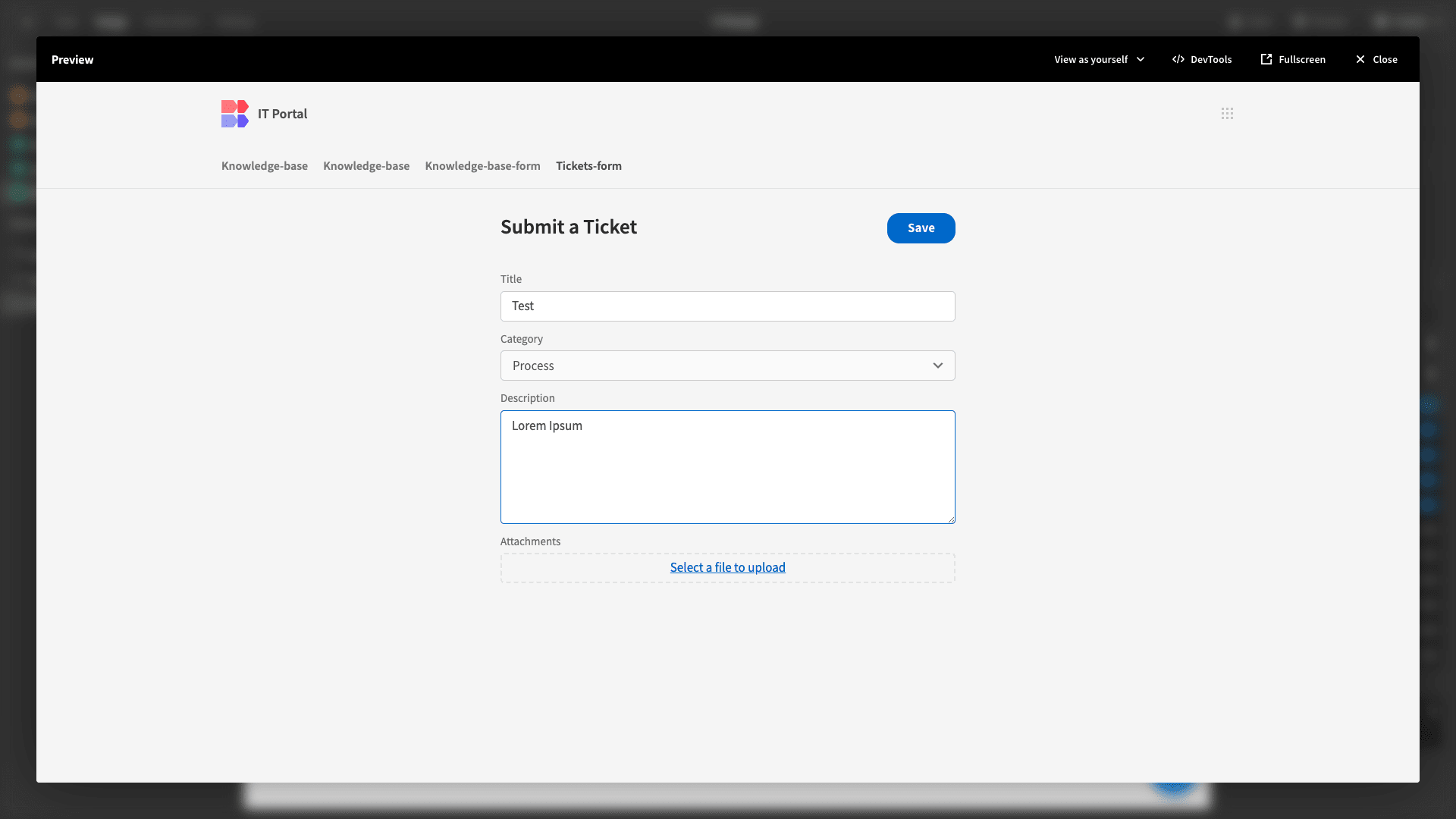
Then, we can preview our app and submit a row of test data to confirm that this works correctly.
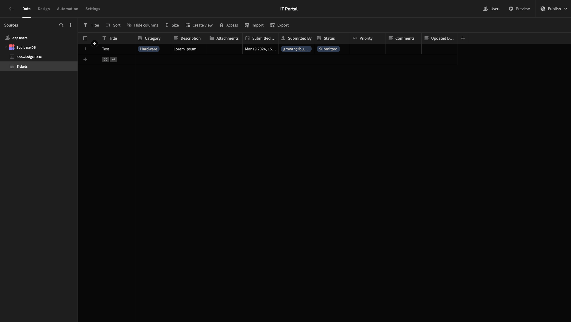
And we can see in the data section that the appropriate values have been saved.
7. Viewing previous tickets
Next, we want to add a screen where Basic user can view their previous tickets and access our form for creating new ones.
We’ll add a new screen, this time choosing the Table layout and selecting our Tickets table as a data source.
We’re also setting the role to Basic again.

The Table layout generates a working CRUD screen based on whichever data table we connect it to.
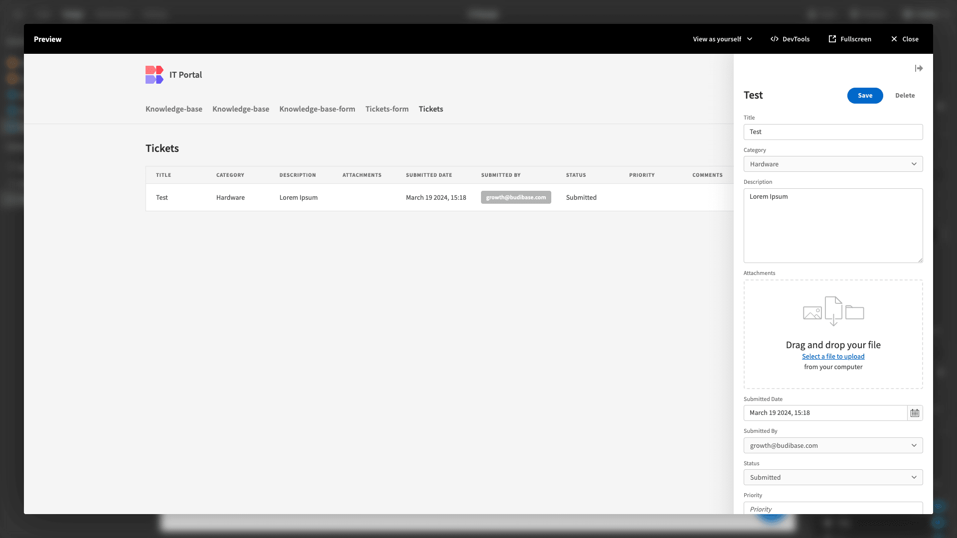
However, we’re going to make a few adjustments so that this suits our purposes a little better.
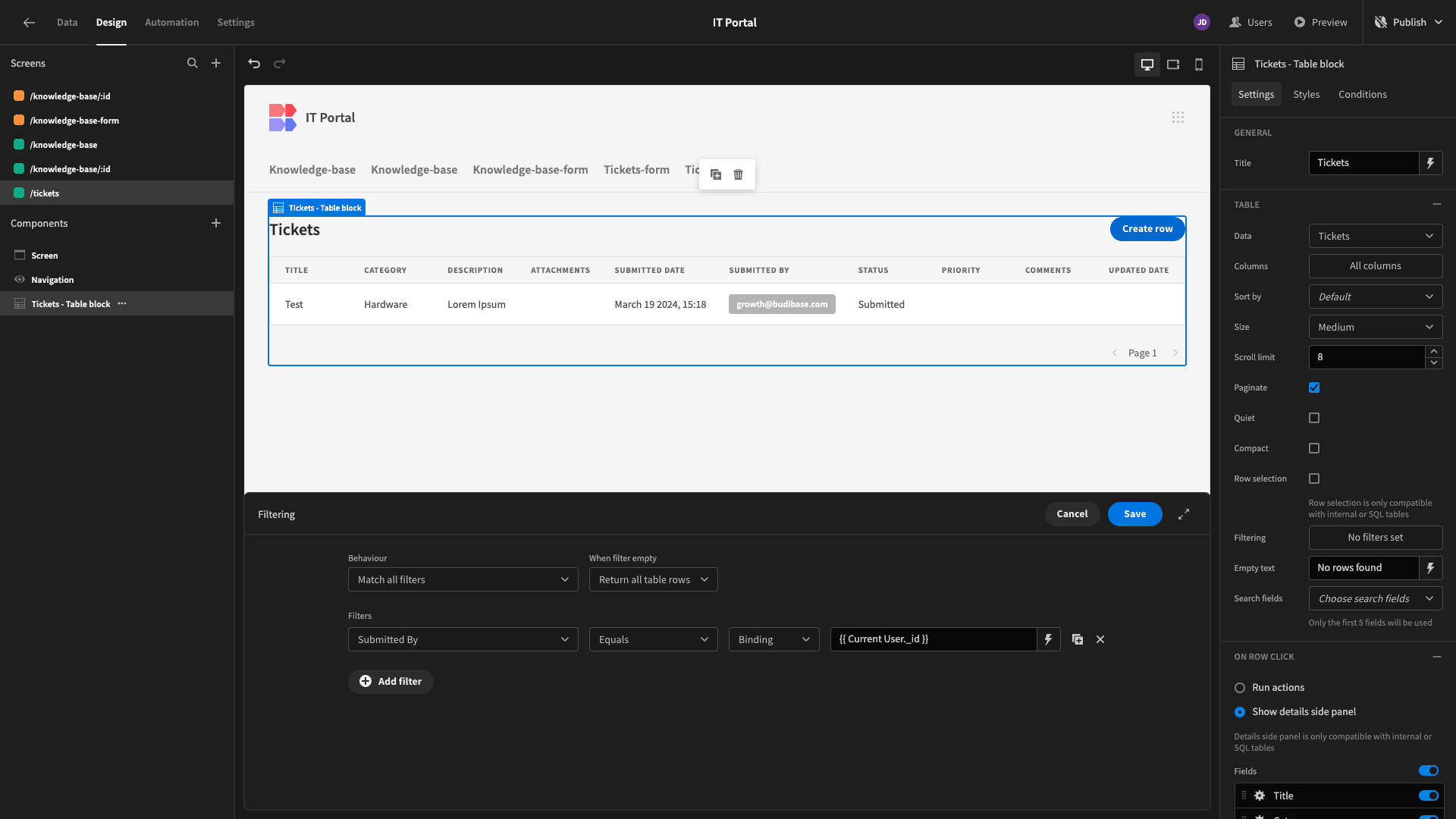
First of all, we need to add a filter so that our users can only view their own submissions. So, we’ll filter our rows so that the Submitted By attribute matches {{ Current User.id }}.
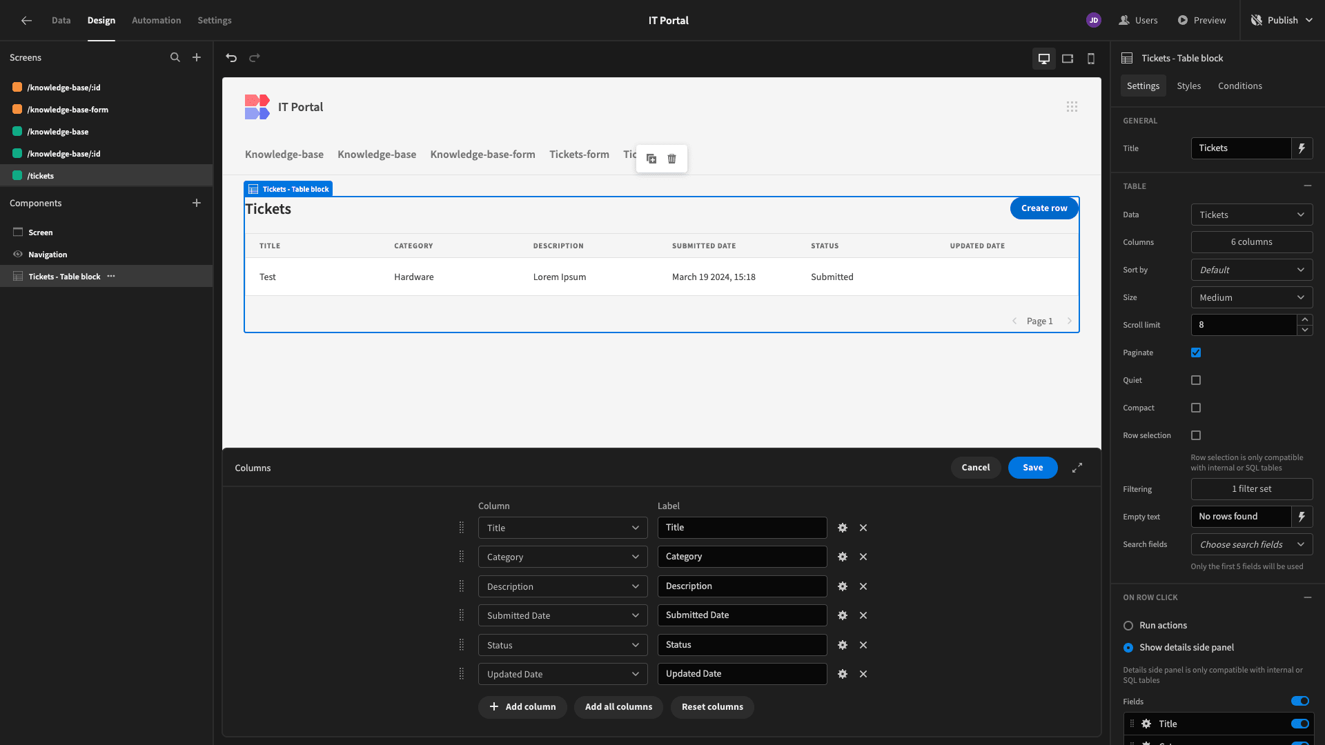
Then, we’ll open the drawer to configure our table’s columns, reducing the number of these that we display.
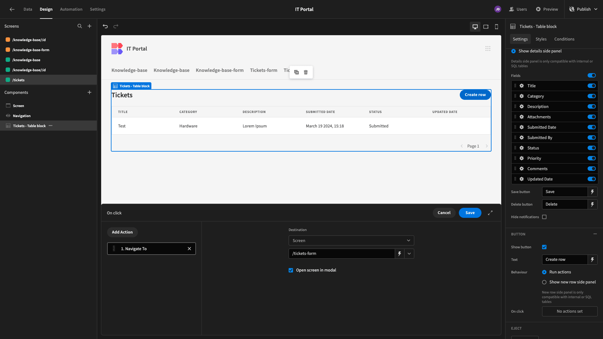
We’ll also update our Create Row button to open our new Ticket form in a modal.
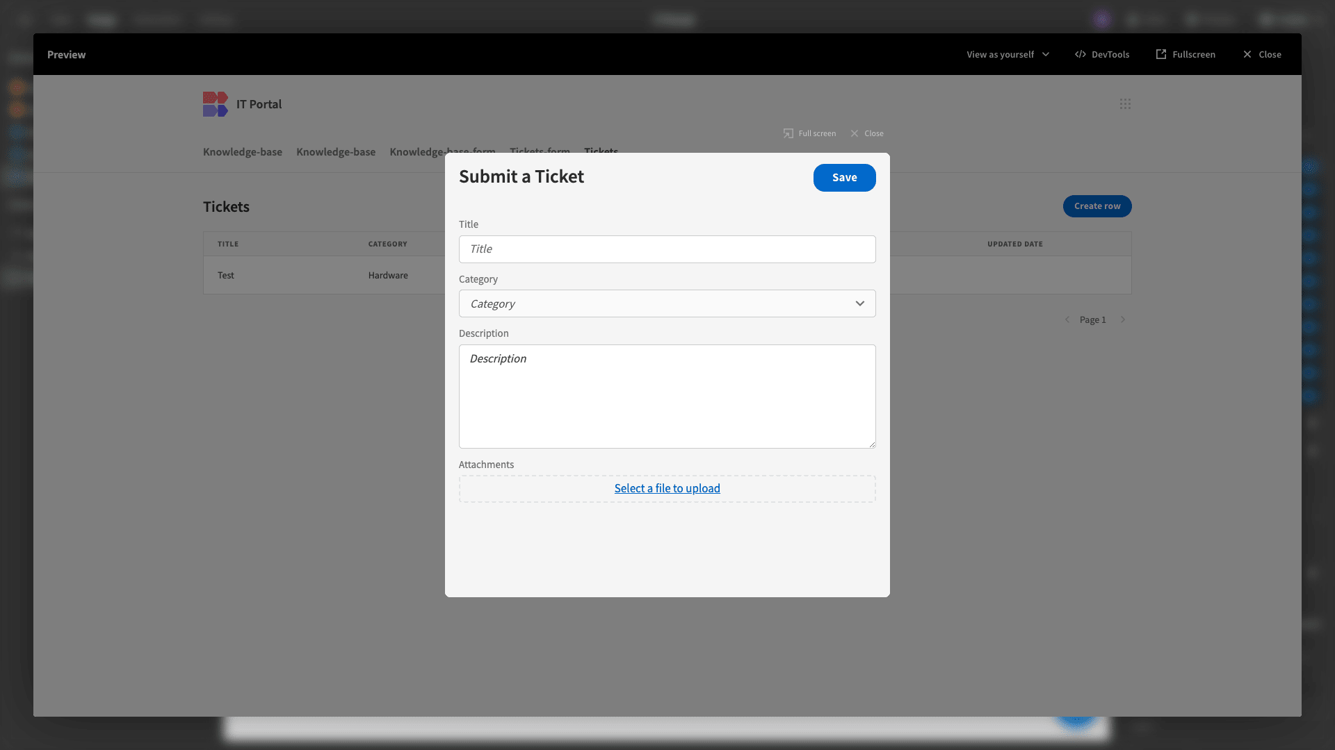
Here’s how this will look.
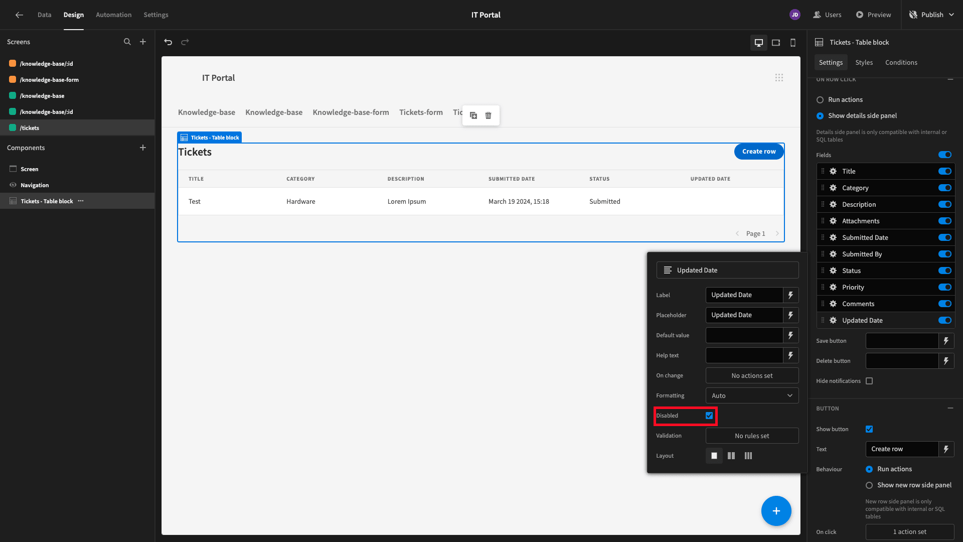
And lastly, for our update row side panel, we’ll toggle the Disable setting for all of our fields - making this form read-only.
8. Adding an admin screen
Finally, we want to add a UI where Power users can view and respond to tickets, regardless of who submitted them.
To do this, we can repeat much of the same process we just used to create our previous screen. However, there will be three differences this time:
- We’ll set the minimum role to Power.
- We won’t filter our table.
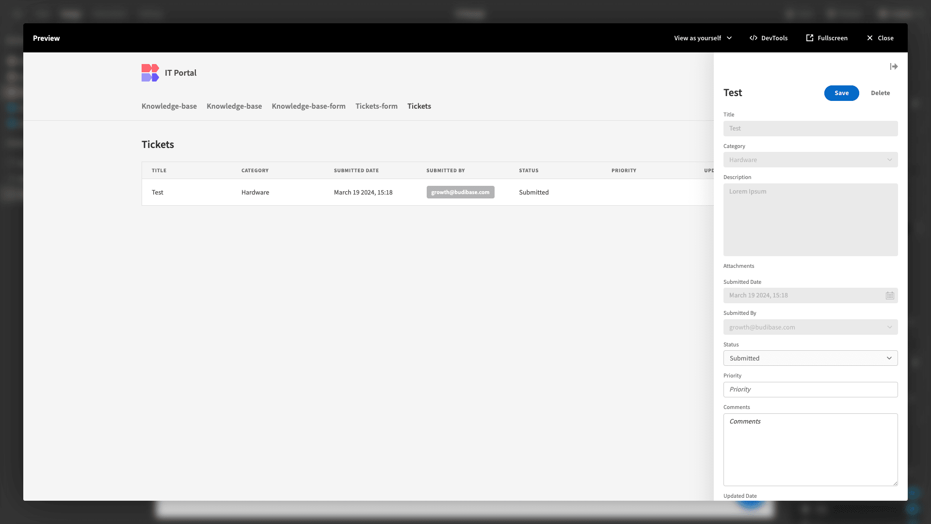
- We’ll only disable the fields submitted by the previous user.
Here’s how this should look.
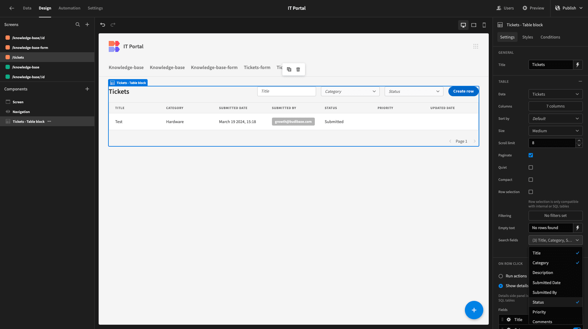
We’ll also add Title, Category, and Status as searchable fields.
And that’s our final screen done.
9. Design tweaks and publishing
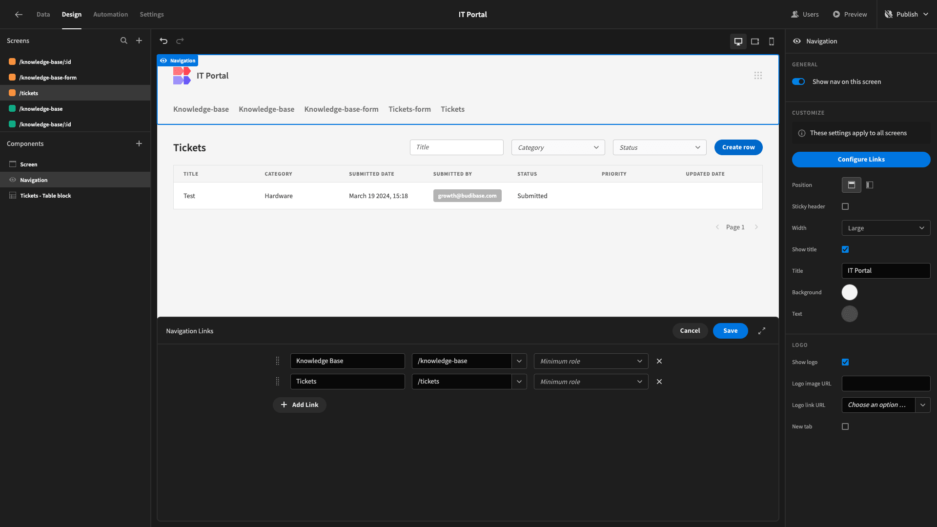
Before we push our IT portal live, we can make some final UX improvements. First of all, we want to tidy up our navigation bar. So, under Navigation, we’ll hit configure links.
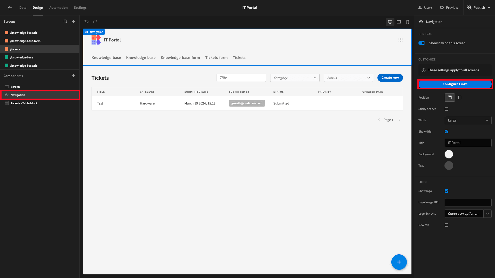
And we’ll set this to only display our main /knowledge-base and /tickets screens.
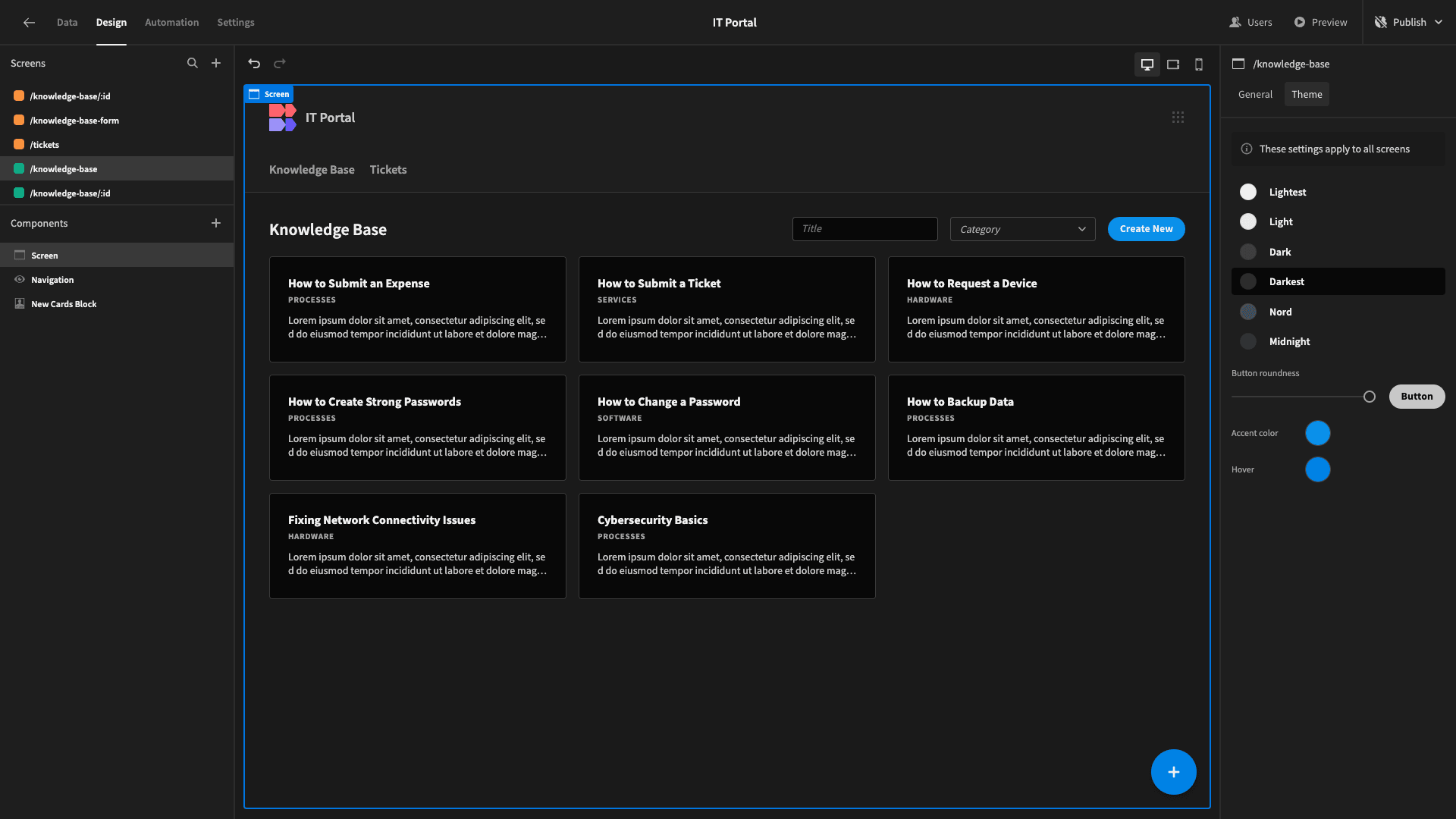
Then, under Screen, we’ll set our app’s theme to Darkest.
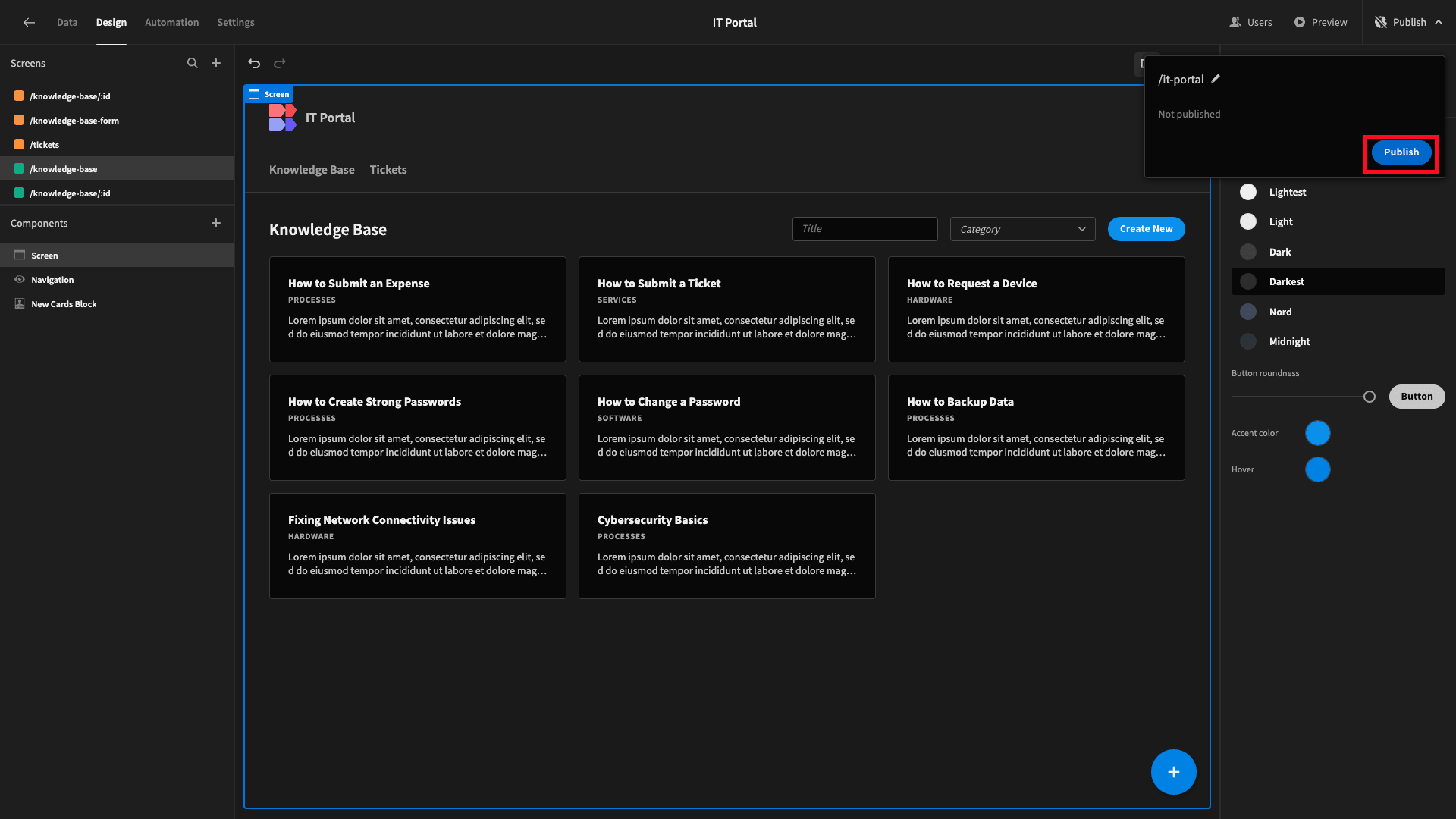
When we’re ready, we can hit Publish to push our app live.
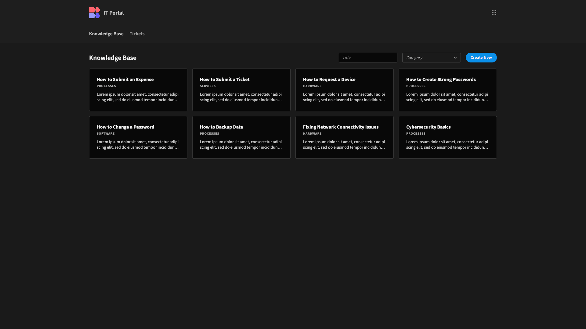
Here’s a reminder of what the finished thing looks like.
Budibase is the fast, easy way to build custom solutions on top of just about any data source.
To learn more about what our platform can do, check out our portal development page.